

Principles of Icon Design
Icons are more than just tiny graphics. They’re the visual shorthand of a digital experience guiding users, enhancing comprehension, and creating intuitive interfaces. But designing great icons isn’t just about looking pretty; it’s about purposeful visual communication.
Let’s break down the 5 key principles of icon design that ensure your icons are not just stylish, but smart and effective:
1. Clarity
Your icon should instantly communicate its meaning. Avoid overly complex illustrations or vague metaphors. If users have to guess what the icon means, it’s not doing its job
Users should understand what an icon represents at a glance without guessing.
💡 Visual Tip: Use clear, universally understood symbols. Avoid decorative elements that don’t serve meaning.
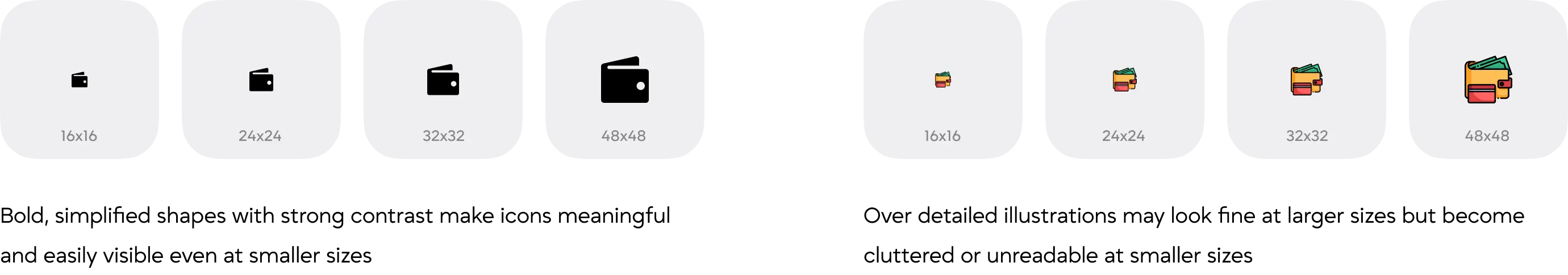
2. Readability
An icon should be legible at all sizes, especially small ones. Intricate details may vanish or blur when scaled down, making the icon confusing.
Test your icons at various sizes (especially 16x16 or 24x24 px). If it doesn’t work small, it doesn’t work at all.
Try This Visual Test: Place your icon in a mock mobile app footer. If you can’t tell what it is, it needs refining.
3. Alignment
Good alignment creates visual harmony across an icon set. Misaligned elements can make icons look awkward or inconsistent.
Use a pixel grid and ensure shapes are optically balanced even if it means adjusting mathematically perfect shapes for visual perfection
Icons with off-center shapes or uneven spacing can feel visually unbalanced, even if technically aligned. This lack of harmony distracts the user and makes the icon appear awkward, inconsistent, or poorly designed within the interface
💡 Tip: Use a grid system (like a 24x24 or 32x32 px grid) and ensure shapes are optically balanced — even if it means adjusting mathematically perfect shapes for visual perfection.
4. Brevity
An icon should convey its intended concept using the simplest and fewest visual elements necessary. Embracing minimalism not only makes the icon more immediately recognizable but also reduces visual noise.
Especially in user interfaces clarity, speed, and usability are key. Simplified icons help users focus, navigate intuitively, and avoid misinterpretation.
💡 Tip: Strip your icon down to its essence. If it can be simplified without losing meaning, it should be.
5. Consistency
Icons in a set should feel like they belong to the same visual family. This means maintaining consistency in stroke width, corner radius, visual style, perspective, and overall design language. When icons follow a unified system, they create a cohesive experience that enhances usability and aesthetic appeal.
In contrast, inconsistent icons can feel disjointed, disrupt user flow, and diminish the professional quality of your interface.
Building a Consistent Icon System
Use these following principles to create icons that share the same style, proportions, and clarity - no matter the set size
-
Grid System
- Use a fixed grid (e.g., 24×24 or 32×32 px) for all icons.
- Align elements to the pixel grid to ensure sharpness and balance.
-
Stroke Width
- Use the same stroke thickness across all icons (e.g., 2 px or 1.5 px).
- Avoid mixing thick and thin lines unless your style specifically calls for it.
-
Choose a Style and Be Consistent
- Outlined
- Filled
- Duotone
- Glyph (solid)
- Rounded or sharp corners
-
Corner Radius
- If you use rounded corners, make sure the radius is consistent (e.g., all corners use 2 px rounding).
-
Perspective & Orientation
- Stick to a single viewpoint: flat, front-facing, or isometric.
- Keep icon elements oriented similarly (e.g., all left-aligned or centered).
-
Size & Proportions
- Keep icon proportions uniform — no icon should feel heavier, taller, or wider than others.
- Icons should occupy the same visual space (e.g., similar whitespace around the edges).
Final Thoughts: Designing Icons That Do More Than Look Good
Icons are the silent workhorses of interface design small in size but massive in impact. When crafted thoughtfully, they guide users effortlessly, communicate ideas instantly, and enhance the overall user experience without demanding attention. In fact, the best icons often go unnoticed not because they lack design, but because they integrate so seamlessly into the interface that users intuitively know what to do next.
By following the seven principles of icon design Clarity, Readability, Alignment, Brevity, Consistency, Personality, and Ease of Use - you ensure that your icons do more than decorate. They become meaningful visual tools that support navigation, reinforce branding, and improve usability across digital products.
Whether you’re designing a mobile app, dashboard, website, or software platform, these principles help you build icons that are not just beautiful, but functional, accessible, and timeless. In a world full of visual noise, great icons speak clearly and that’s what makes them powerful
At Artocea, we bring these principles into every UI/UX design project, ensuring that icons not only look good but truly enhance the user journey.

DESIGN STORIES
At Artocea, every project goes beyond visuals, becoming a story shaped through design. We craft experiences that truly connect, whether it’s an app, a brand, or an animation.
Our creative team blends clarity, detail, and personality to craft work that stands out and leaves a lasting impression.