


Design is evolving fast. And in 2025, UI design is entering one of its most exciting, expressive, and thoughtful phases yet. Interfaces are becoming more human, more adaptive, and more immersive. But this transformation isn’t just about aesthetics, it’s about building meaningful, seamless experiences for real people.
At Artocea, we work closely with brands across industries to design digital products that don’t just look good, they feel intuitive, perform brilliantly, and leave lasting impressions. Here’s our curated take on the UI design trends shaping 2025, and how we’re bringing them to life in our work.
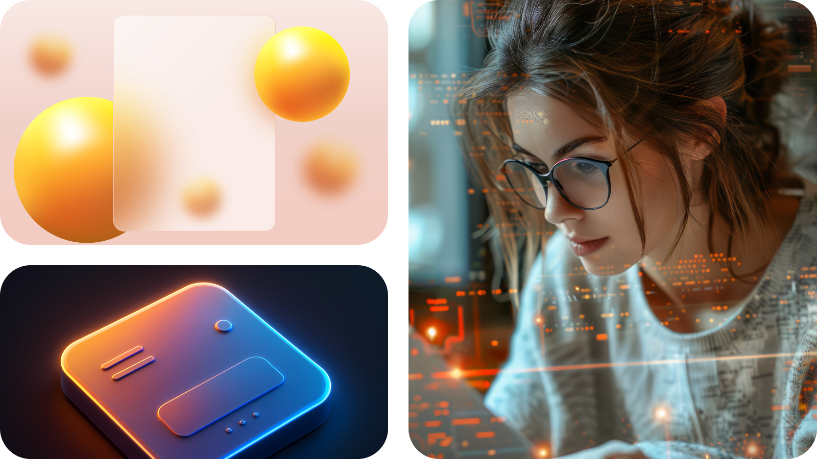
3D elements are no longer a nice-to-have, they’re becoming core to digital storytelling. With advancements in WebGL, GPU rendering, and AR/VR integration, designers can now incorporate real-time 3D visuals into everyday interfaces without sacrificing performance. Whether it’s showcasing a product in interactive 360°, creating a layered scroll journey, or simulating depth for navigation, 3D brings interfaces to life.
💡 Artocea’s Take: We’re combining stylized 3D assets with minimal UI to let products speak for themselves, especially in ecommerce and educational experiences where immersion increases conversion and retention.
Gone are the days of static layouts. AI-driven personalization is turning interfaces into living systems, adapting in real-time to user behavior, context, and preferences. From dashboards that surface relevant data first, to media apps that restructure content based on your mood or usage pattern, intelligent UI means no two user journeys look exactly the same.
💡 Artocea’s Take: We design modular systems that adjust on-the-fly, powered by recommendation engines and real-time usage patterns. It’s about creating a “designed for me” feeling, every time.
Inspired by Japanese bento boxes, bento-style grid layouts break down complex content into visually digestible, modular blocks. These layouts allow users to scan information quickly while maintaining visual balance. They’re perfect for dashboards, landing pages, and case studies, offering both clarity and rhythm.
💡 Artocea’s Take: We’re using bento grids in SaaS UIs and creative portfolios, pairing them with micro-interactions to create layouts that feel alive, modular, and meaningful across devices.
Motion is no longer an afterthought, it’s strategy. In 2025, we use animation to do more than delight; it clarifies transitions, communicates state changes, and creates intuitive flows. When used with purpose, motion guides the user like a silent narrator, telling them exactly what’s happening and where to focus next.
💡 Artocea’s Take: We prototype with motion from the start, not just to decorate but to define interaction patterns. Thoughtful transitions make interfaces feel natural and “alive” without being distracting.
Typography is moving, and not just metaphorically. Kinetic typography introduces motion into text, turning headers, intros, and calls-to-action into expressive, dynamic elements. These animations add rhythm, emphasize key messages, and enhance brand storytelling, whether triggered by scroll, hover, or voice.
💡 Artocea’s Take: We use kinetic typography in landing pages and hero sections to introduce personality and hierarchy. When done right, text becomes a visual performer, not just a narrator.
Dark mode has matured into a fully responsive, context-aware design standard. It adapts to lighting conditions, time of day, or device preferences offering a visually comfortable experience that feels smart and sustainable. Modern dark modes go beyond black, with deep neutrals, rich shadows, and color-calibrated contrast to reduce strain and improve focus.
💡 Artocea’s Take: We build dual-mode design systems that respect user environments and screen types, particularly for OLED and AMOLED devices where dark UIs literally save power.
Neumorphism and glassmorphism are evolving. These soft, tactile aesthetics, featuring blurred glass panels or subtle shadows are being used more thoughtfully to enhance visual storytelling and UI structure. When implemented with accessibility in mind, they create interfaces that feel natural, elevated, and future-facing.
💡 Artocea’s Take: We apply morphism techniques selectively, using contrast tools and depth principles to ensure both beauty and usability. Less fluff, more feeling.
Microinteractions have grown up. It’s not about adding flair, it’s about building trust through subtle cues. When a button pulses gently, a field auto-validates, or a progress bar animates naturally, users feel in control. These little details often define how “finished” and thoughtful a product feels.
💡 Artocea’s Take: We design microinteractions to signal clarity, confirming actions, preventing errors, and guiding focus. They’re small, but they make your product feel premium.
Scrolling is the new clicking. In 2025, we’re crafting scroll experiences that unfold like chapters, layering content, motion, and interaction in a way that feels narrative and intuitive. This trend turns portfolios, product reveals, and even service explainers into interactive stories.
💡 Artocea’s Take: We use parallax, pinning, and animation triggers to control pacing, so the user isn’t just scrolling, they’re journeying.
Accessibility is a design superpower. Inclusive design isn’t a checklist, it’s a mindset. More than ever, we’re prioritizing contrast, legibility, screen reader compatibility, and keyboard-first navigation to ensure that every interaction is usable by everyone, regardless of ability or context.
💡 Artocea’s Take: Accessibility is baked into our design system foundations. We believe a product that excludes, even unintentionally is a product that’s not yet complete.
In 2025, UI design is about meeting users where they are with intelligence, empathy, and craft. It’s about interfaces that feel alive, adapt to context, and elevate utility through beauty. At Artocea, we don’t just follow trends, we design for what matters: connection, clarity, and experience.
📩 Let’s build something remarkable together - Drop us a line →
Building your dream project? Then don't let your customers get lost in the clamour of buttons, forms and text. A story is more than just words, it deserves a beautiful narration, with bells, whistles and a beautiful flow. Let us help you tell your story in a way that's truly special.