Overview
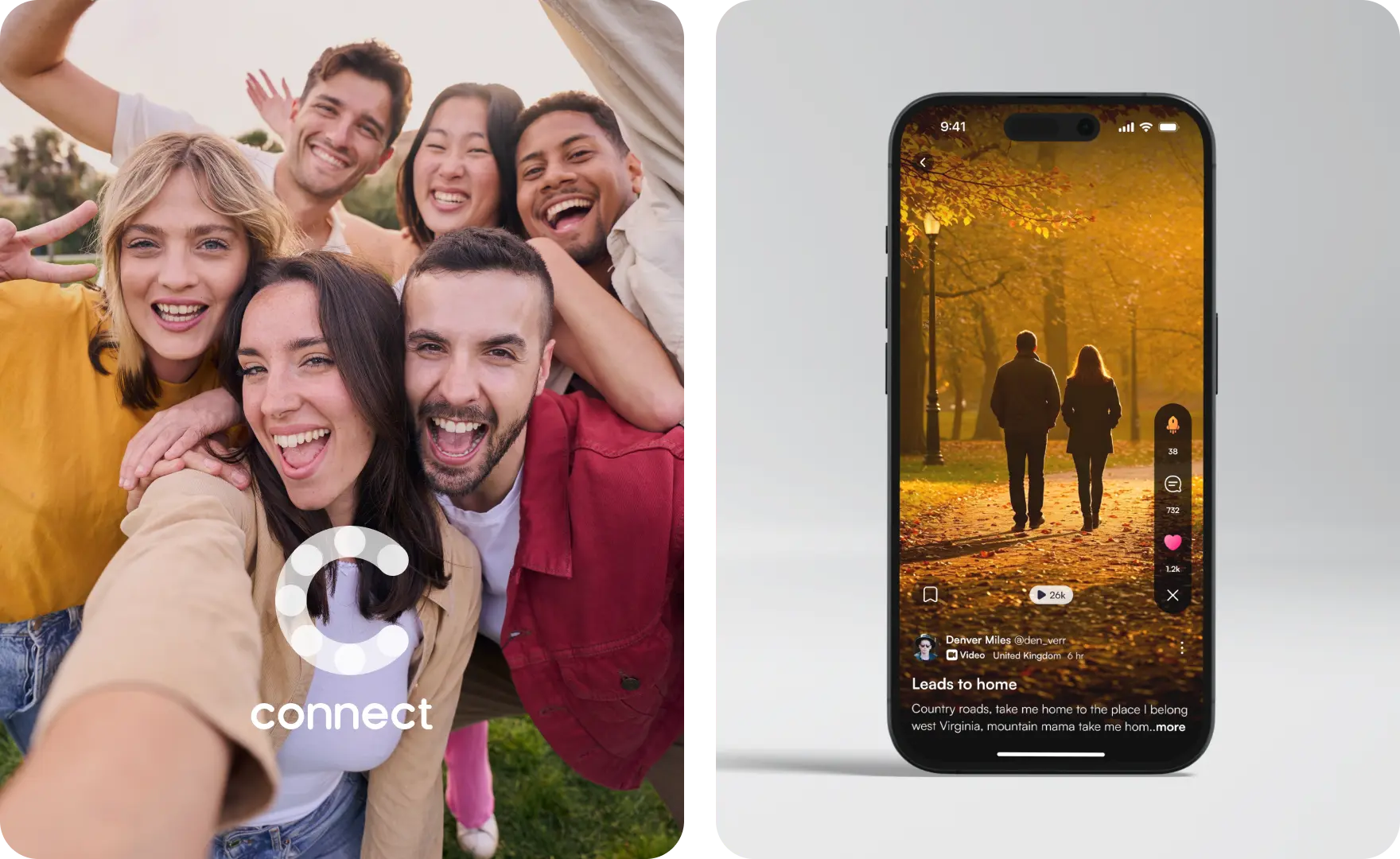
Rewarding Social Connection
Connect is a modern platform built for real interactions with friends, family, or communities. It focuses on clarity, control, and meaningful sharing.
Clean layouts and privacy-first features make it easy to share on your terms. And with built-in rewards, every post, like, and comment feels more valuable.
Unlike typical social apps, Connect doesn’t chase endless scrolling. It’s built to make your time feel well spent - where engagement feels real, and every interaction has purpose.
The Challenge
Creating a new social platform today is no small task. Most apps leave people feeling burned out and disconnected. The issue isn’t features - it’s the lack of genuine connection.
With Connect, the goal was to design a space that feels calm, real, and human. A platform that encourages presence over pressure, and connection over performance.
We built it to center people - not content, not clicks. Every screen was shaped for clarity, comfort, and meaningful interaction.
Our Goal
- Rethink social Move away from performance and refocus on real connection.
- Design for presence Encourage slower, more intentional interactions without the usual noise.
- Respect the user Treat people as individuals - not content producers or data points.
- Make it feel good Build a space that feels calm, real, and worth returning to.
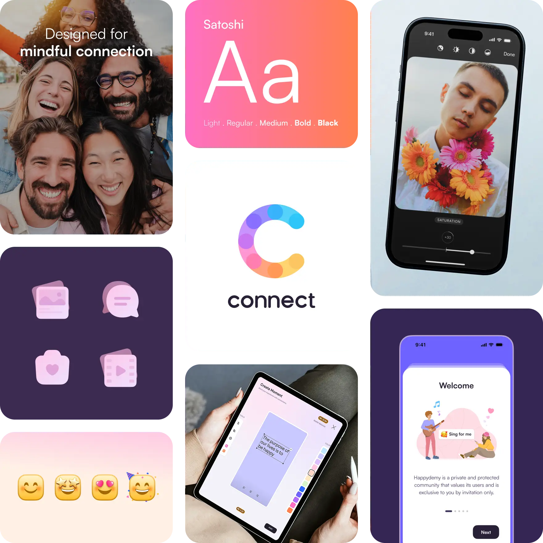
Design System
We crafted a modular design system that keeps the interface consistent, clear, and easy to scale.
Our Approach
We approached the design of Connect with a clear goal - to rebuild the social experience with intention. Starting from scratch gave us space to rethink every screen, free from the clutter and patterns of typical social apps.
Our focus was on how people naturally connect. We simplified the experience to core actions like sharing and browsing, then shaped each part of the interface to feel intuitive, personal, and easy to use.
Everything was guided by solid UX thinking. Layouts, micro-interactions, and visual tone were all designed to create a calm, modern experience that supports real connection.
- Clear layout Each screen guides attention with simple structure and visual breathing room.
- Familiar flow Interaction patterns stay consistent so users always feel oriented.
- Calm interface Rounded elements, neutral colors, and soft contrast give the app a warm, focused feel.
- Thoughtful Motion Micro-interactions give clear, quiet responses that make the interface feel alive.
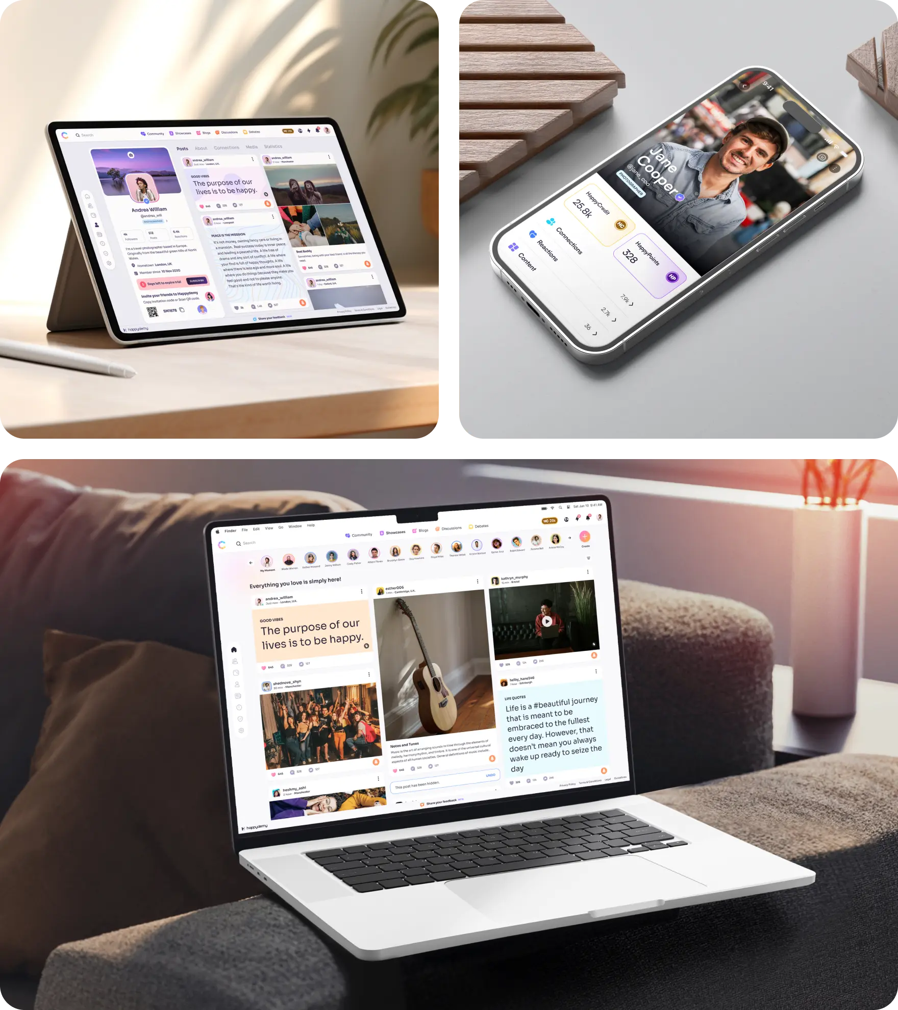
Responsive by Design
Adapts seamlessly across devices with a consistent, intuitive experience on every screen.
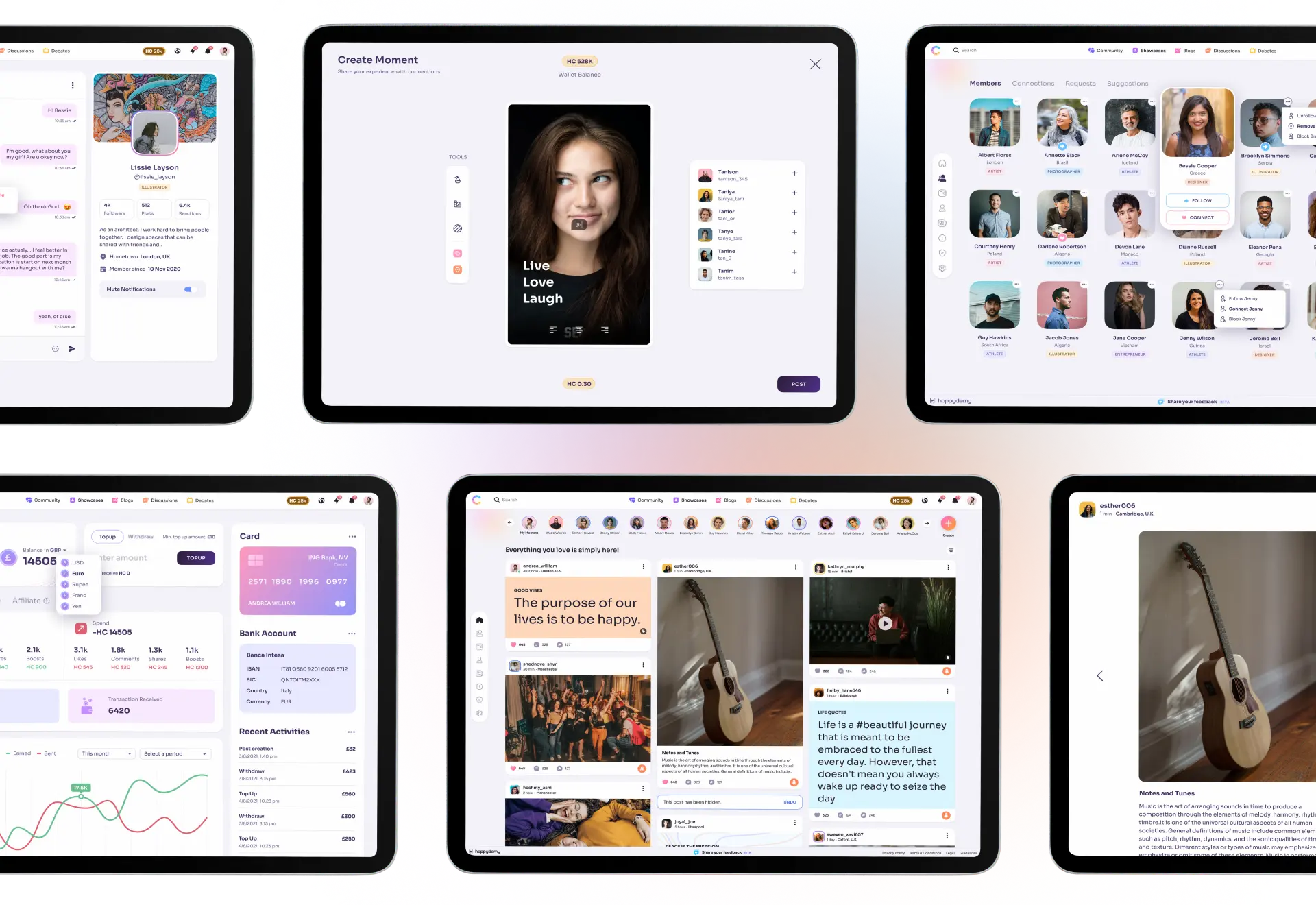

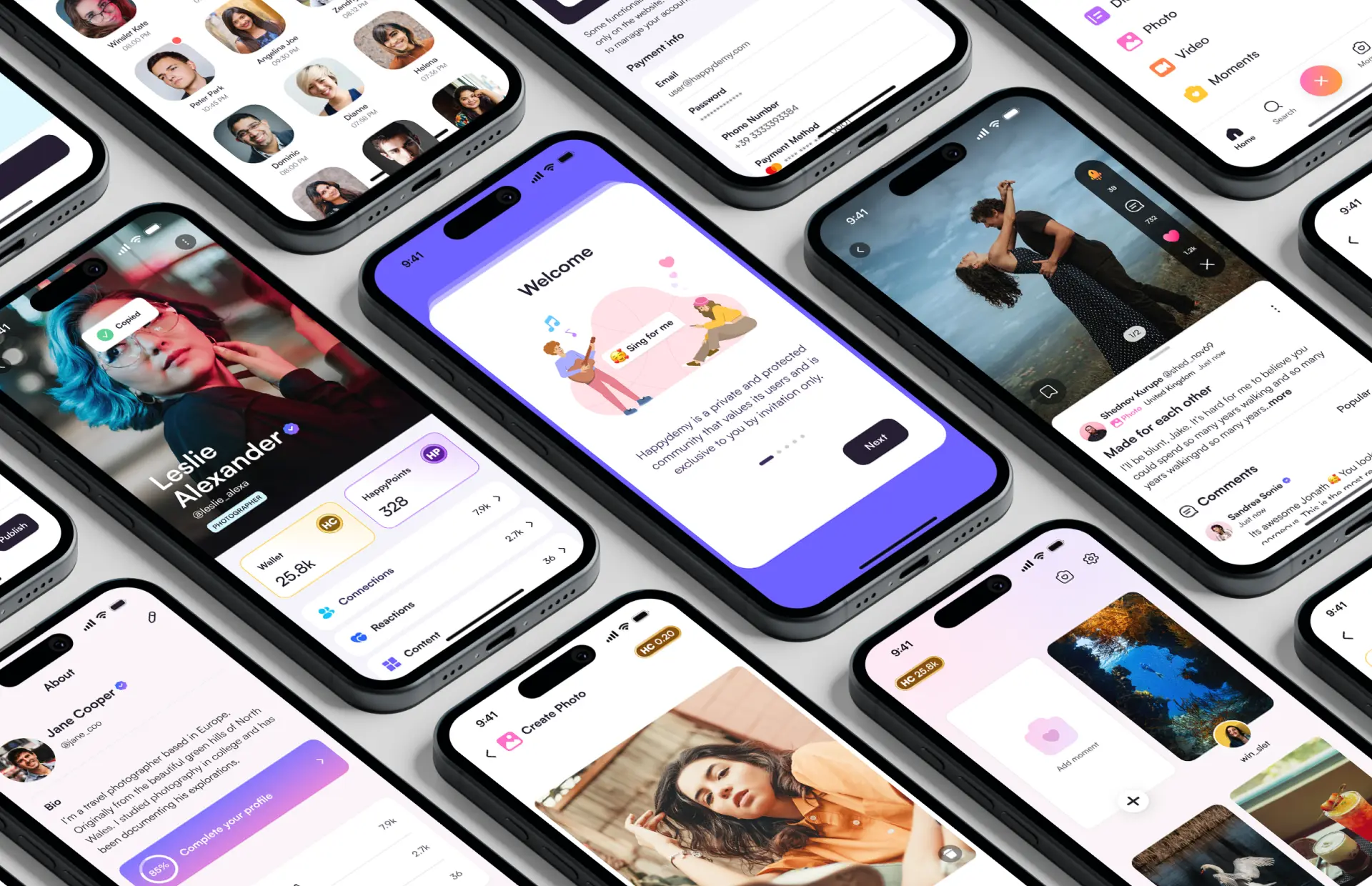
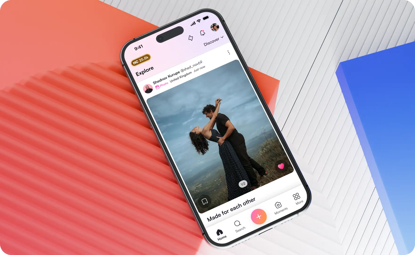
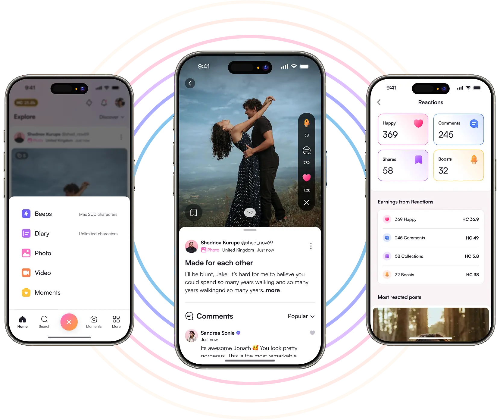
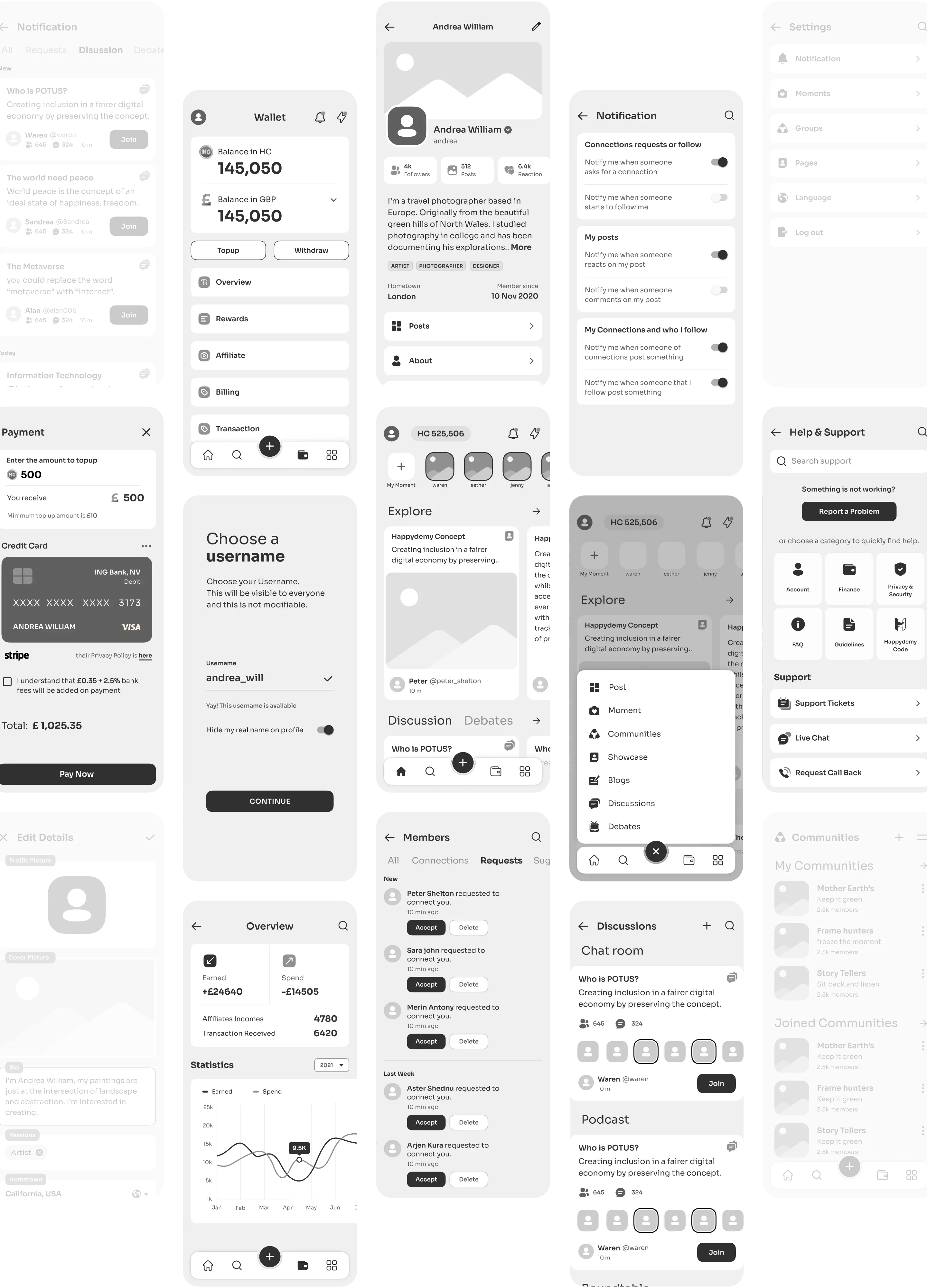
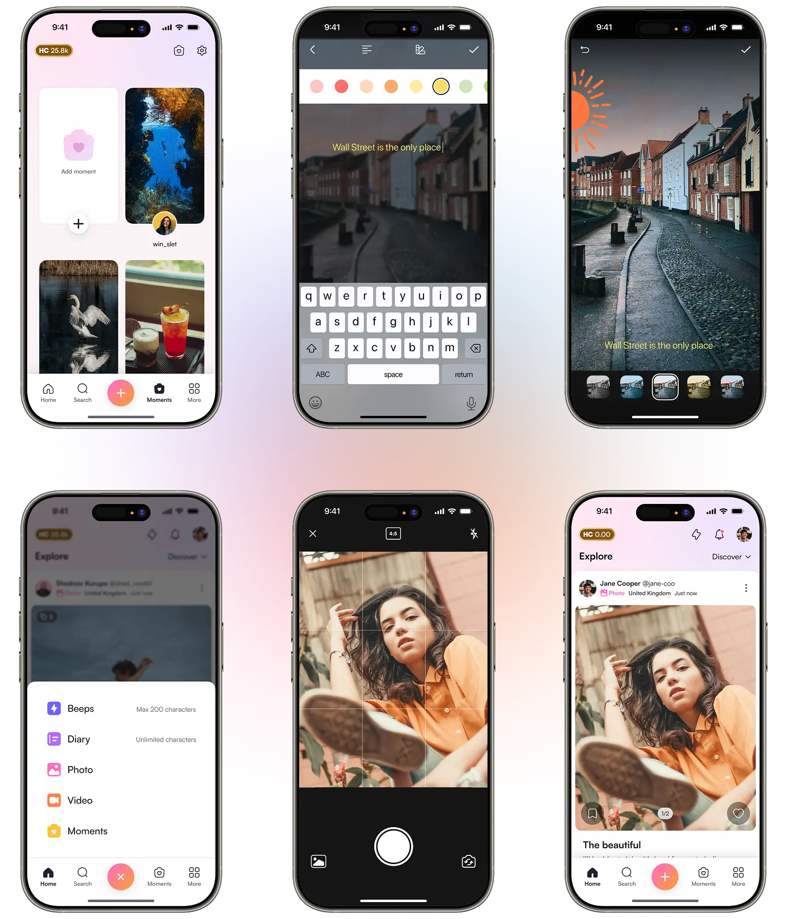
App Experience
Designed for clarity and flow, the mobile app makes sharing and browsing effortless.
The Impact
Designing Connect wasn’t about reinventing social media. It was about stripping it back to what people actually want - simplicity, control, and a space that feels good to use. Every decision was made to reduce noise and build trust.
The result was an interface that felt familiar yet calmer. Users didn’t need a tutorial to navigate. They felt safe sharing, knowing exactly who would see their content. Small design choices made big differences in how people interacted with the product.
What stood out most was how users responded emotionally. They described the app as “relaxing” and “not trying too hard” - exactly the tone we aimed for.
- Clarity builds trust Visible controls and clean layout helped users feel more confident with every action.
- Less can feel better Removing clutter made the product feel faster, easier, and more intentional.
- Design affects emotion A calm tone and thoughtful flow created a space users described as peaceful and safe.
- Usability Comes First Easy to read, easy to use, and everything’s right where it should be.