BUILT FORMEANINGFULCONNECTION
Creating a more personal social experience built around real connections, privacy and greater control.

The Project
Connect is a social networking platform built around a simple idea: people should have more control over their identity, content and personal information.
Our role was to shape the brand identity and product experience, creating a visual language that feels approachable, recognisable and different from traditional social platforms.
The design brings Connect's focus on trust and genuine relationships into an experience that feels natural from the first interaction.
- Location
- United Kingdom
- Scope
- BrandingProduct DesignDesign System
- Sector
- SocialmediaCommunity
The Challenge
Social networking has become increasingly focused on advertising, engagement and collecting user data. Connect wanted to offer a different experience without making social interaction feel unfamiliar.
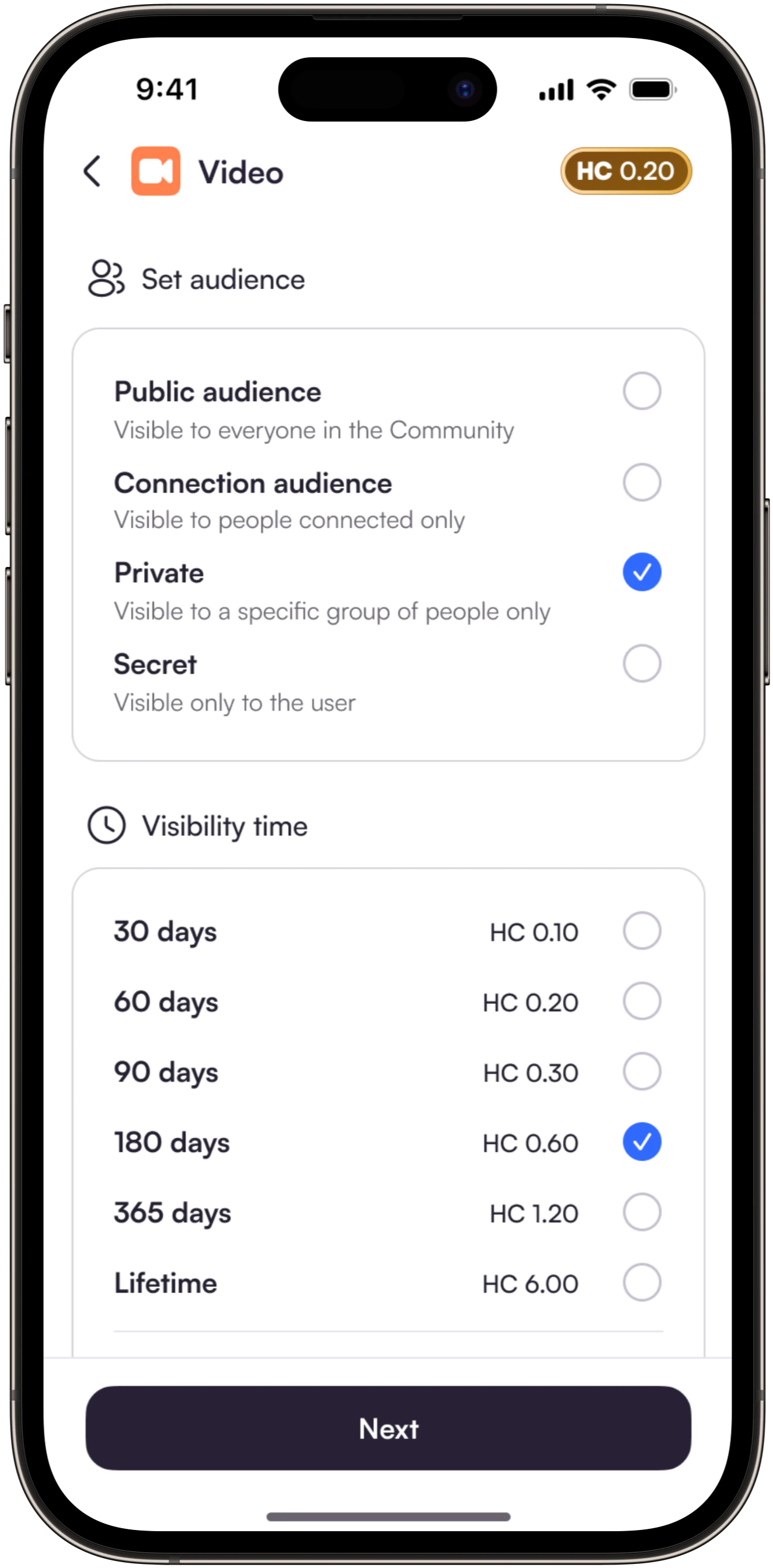
The challenge was to make trust, privacy and ownership visible through design, while keeping everyday actions like browsing, sharing and connecting simple.
Product Experience
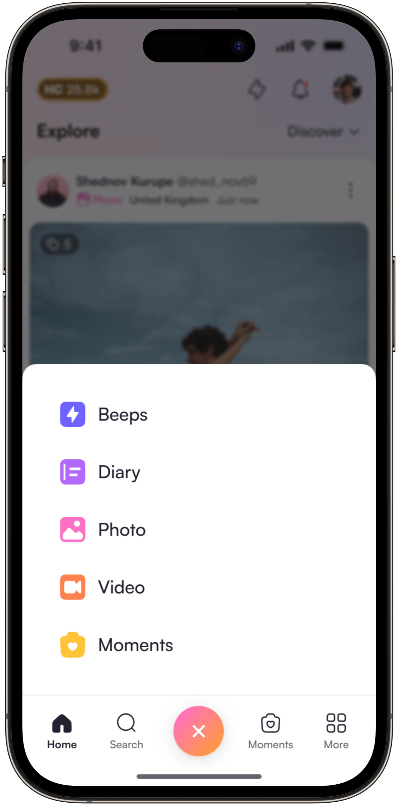
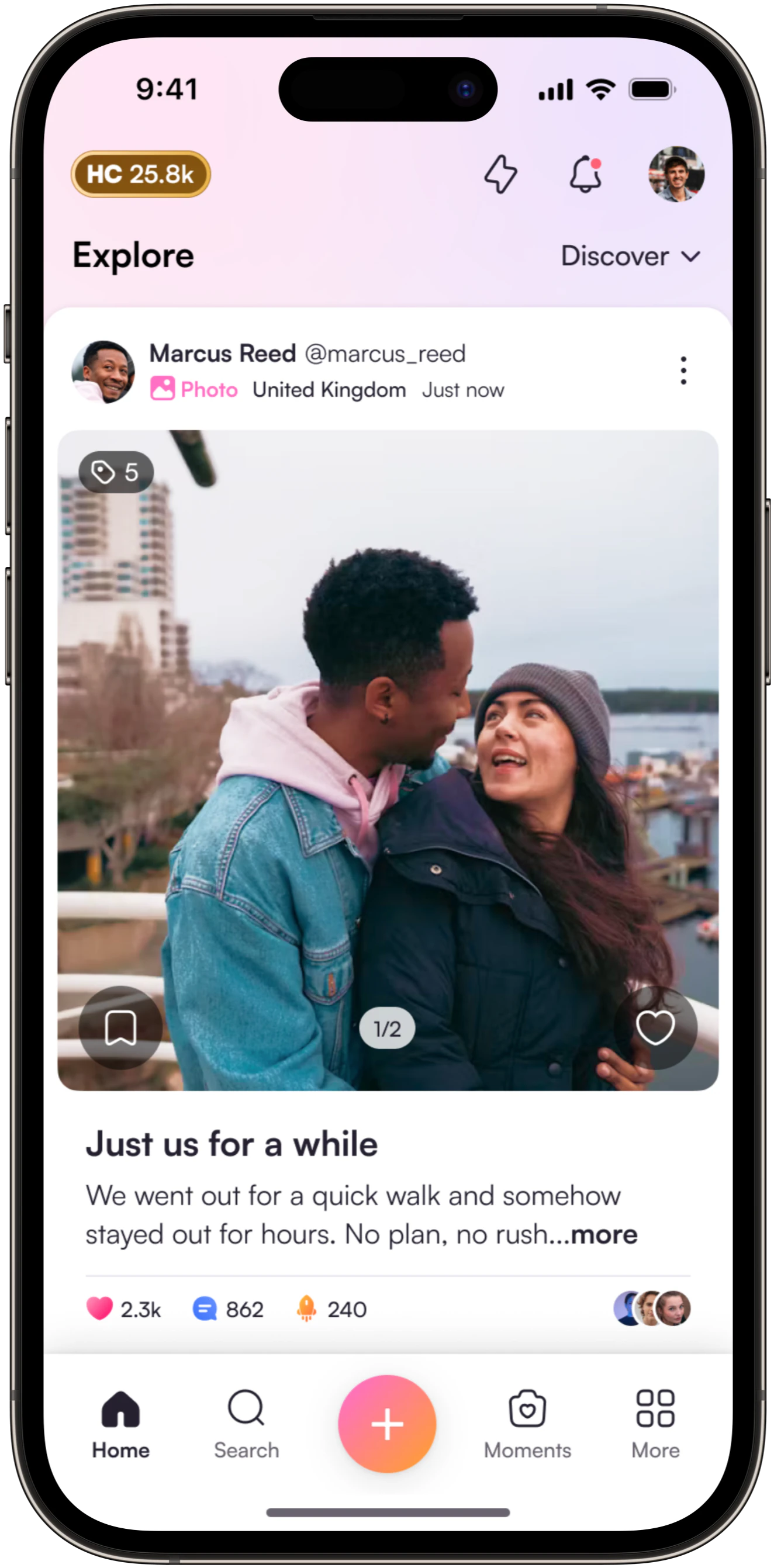
The product needed to feel familiar while offering a more thoughtful approach to social interaction.
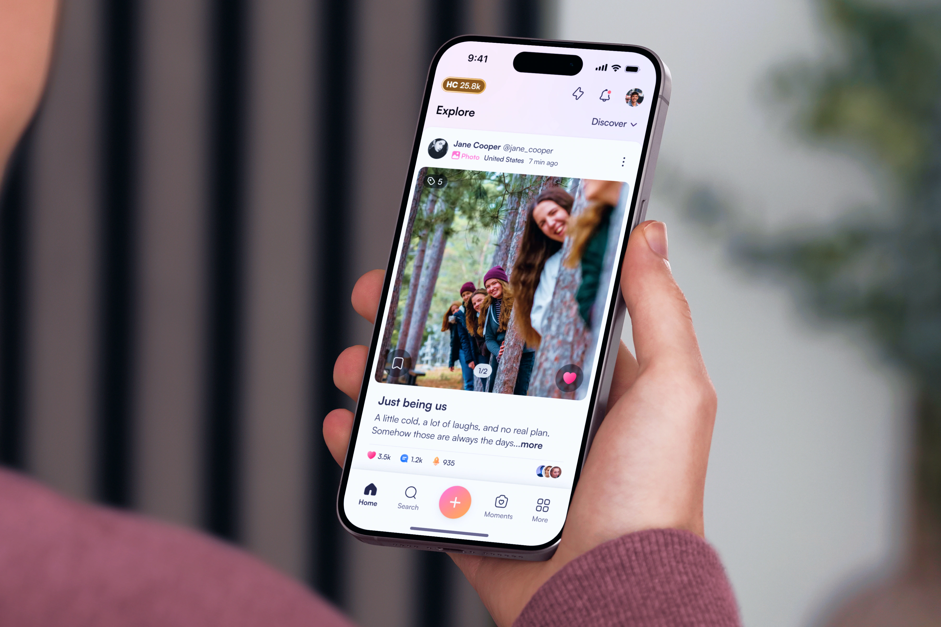
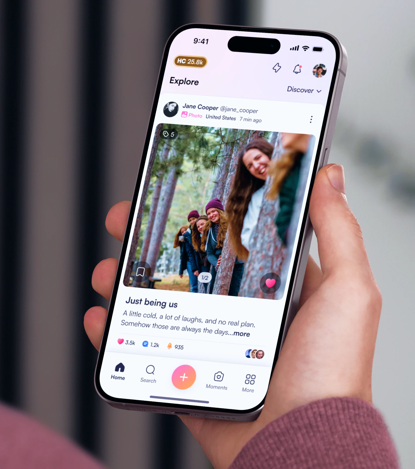
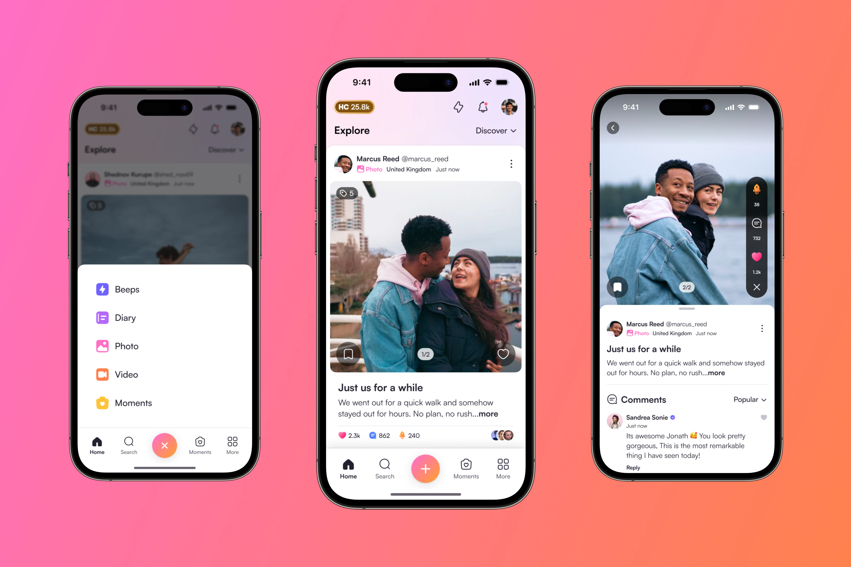
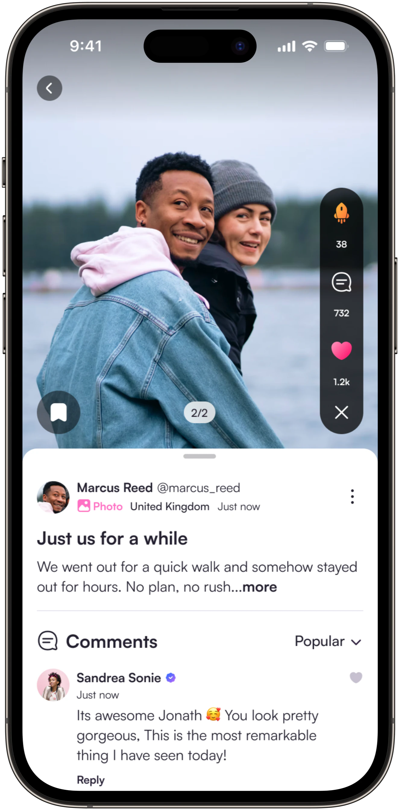
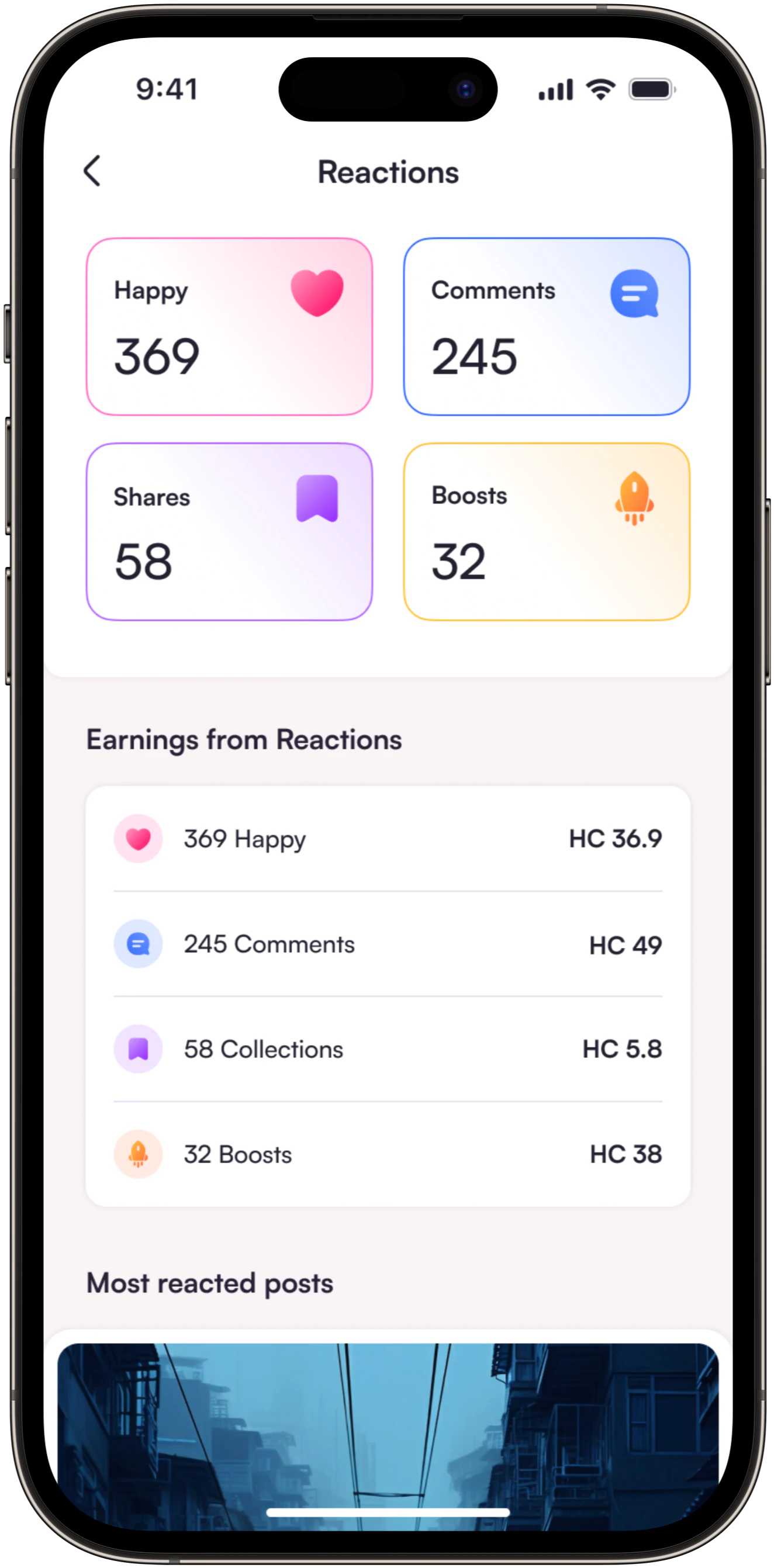
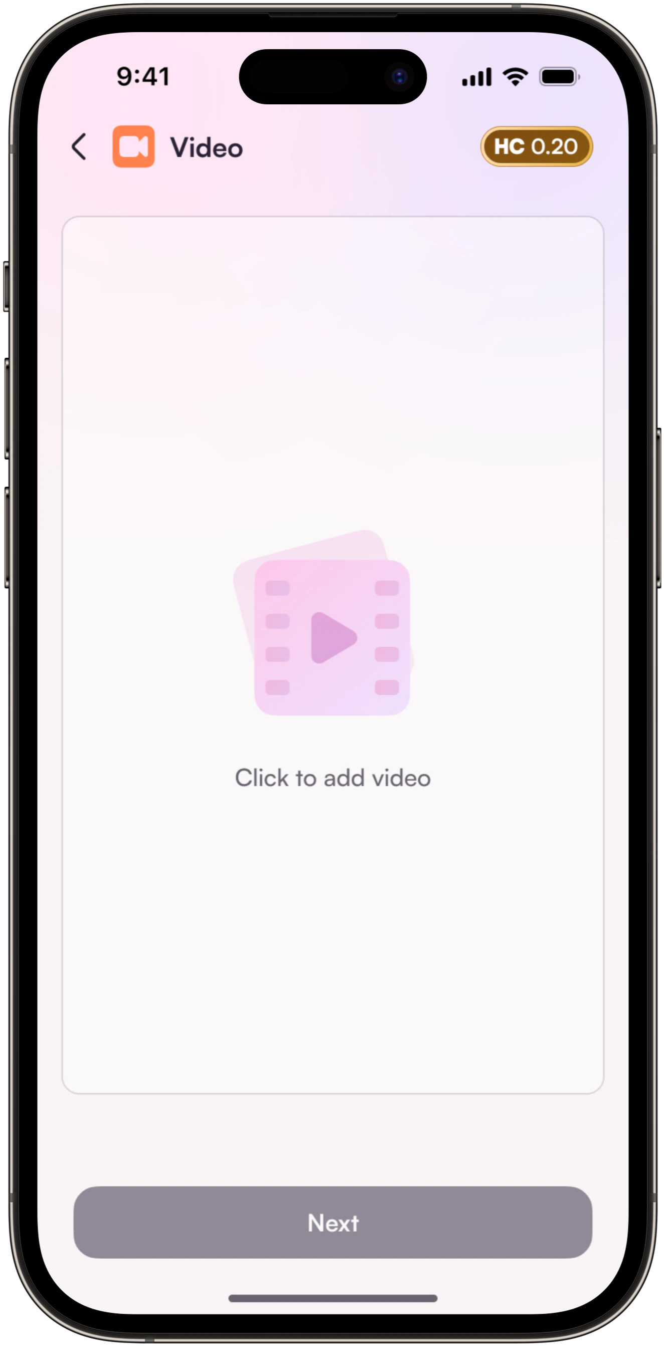
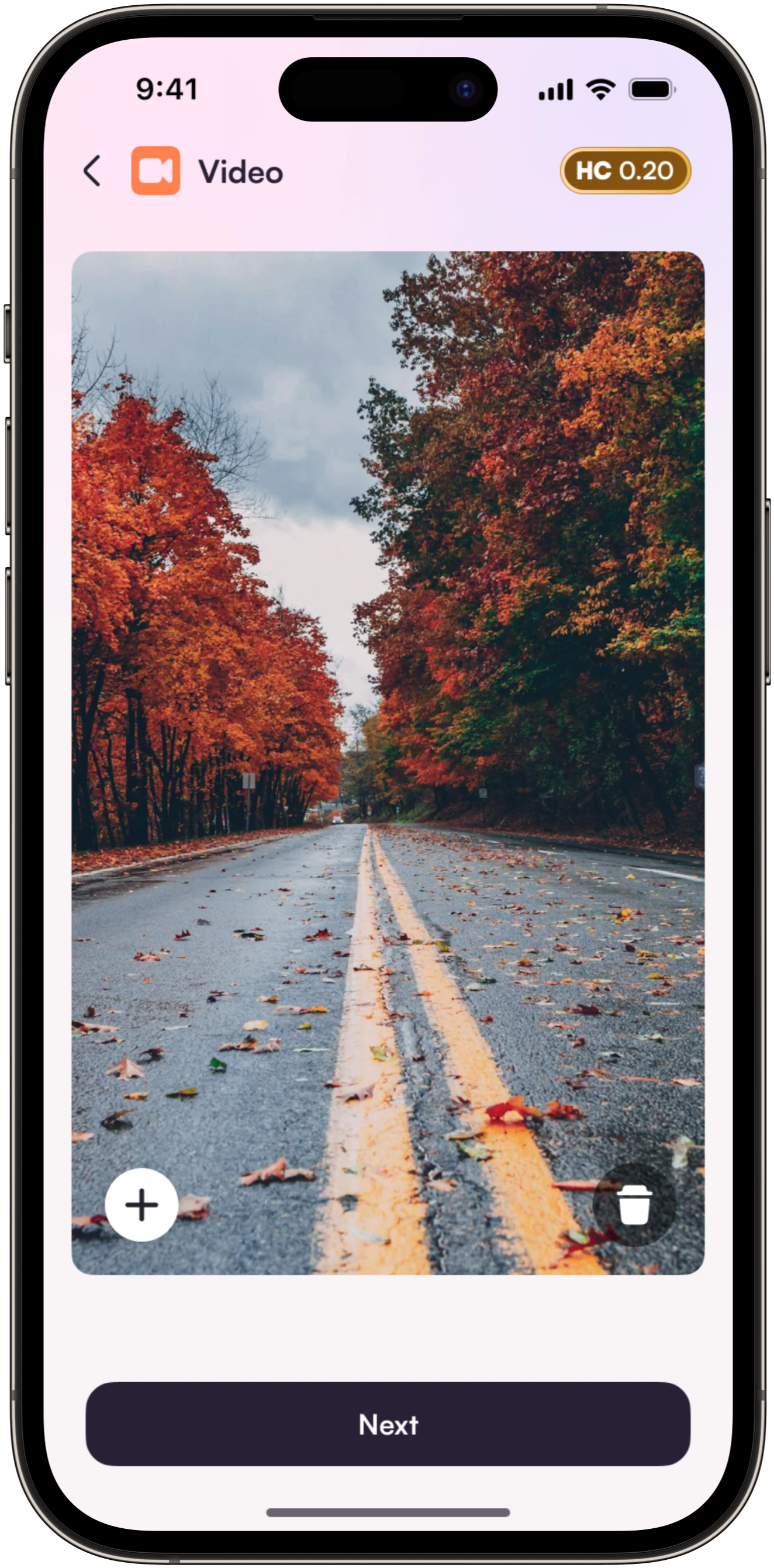
We designed clear navigation, structured feeds and simple interaction patterns around how people already connect and share. The focus was on making everyday actions intuitive without unnecessary distractions.
Brand Identity
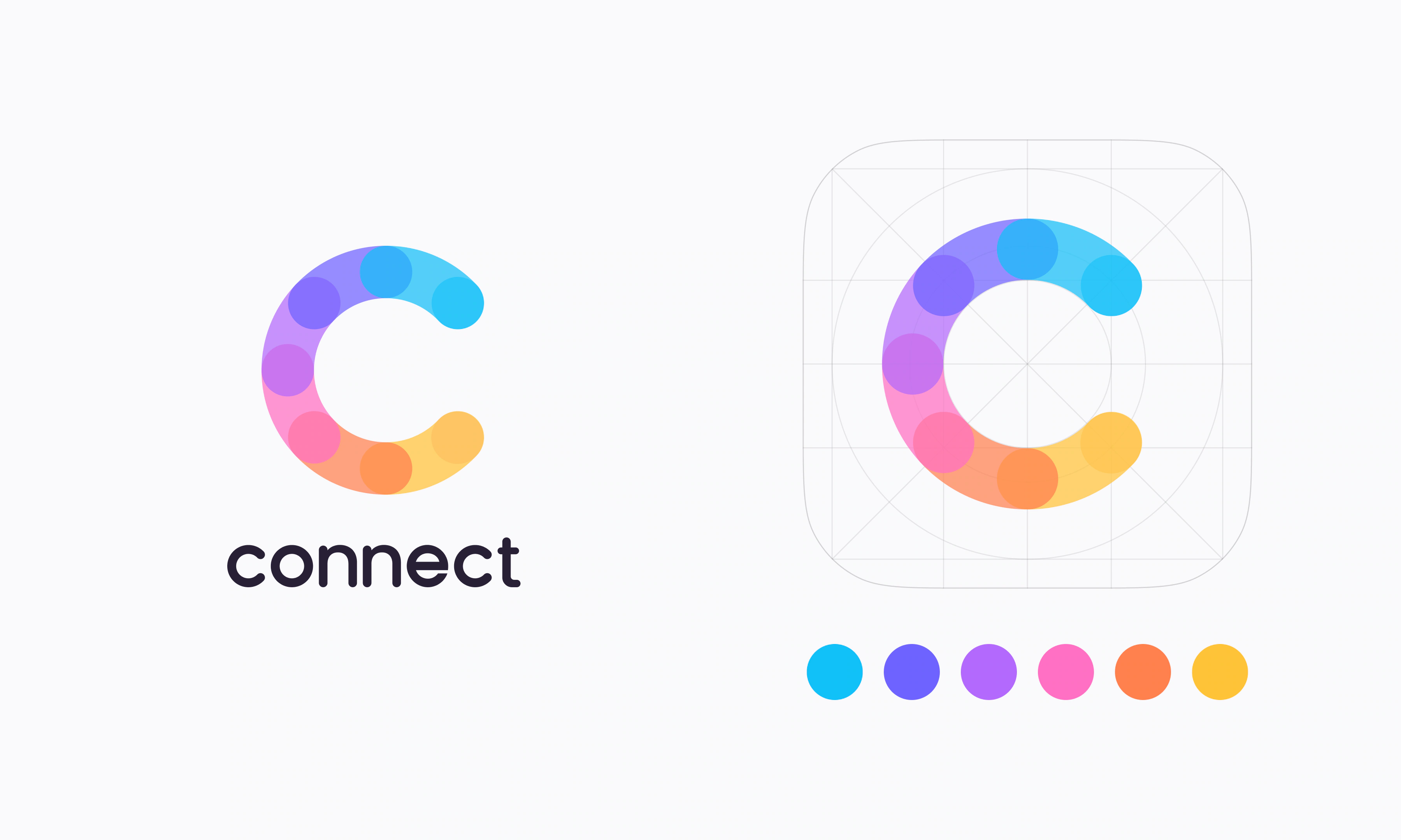
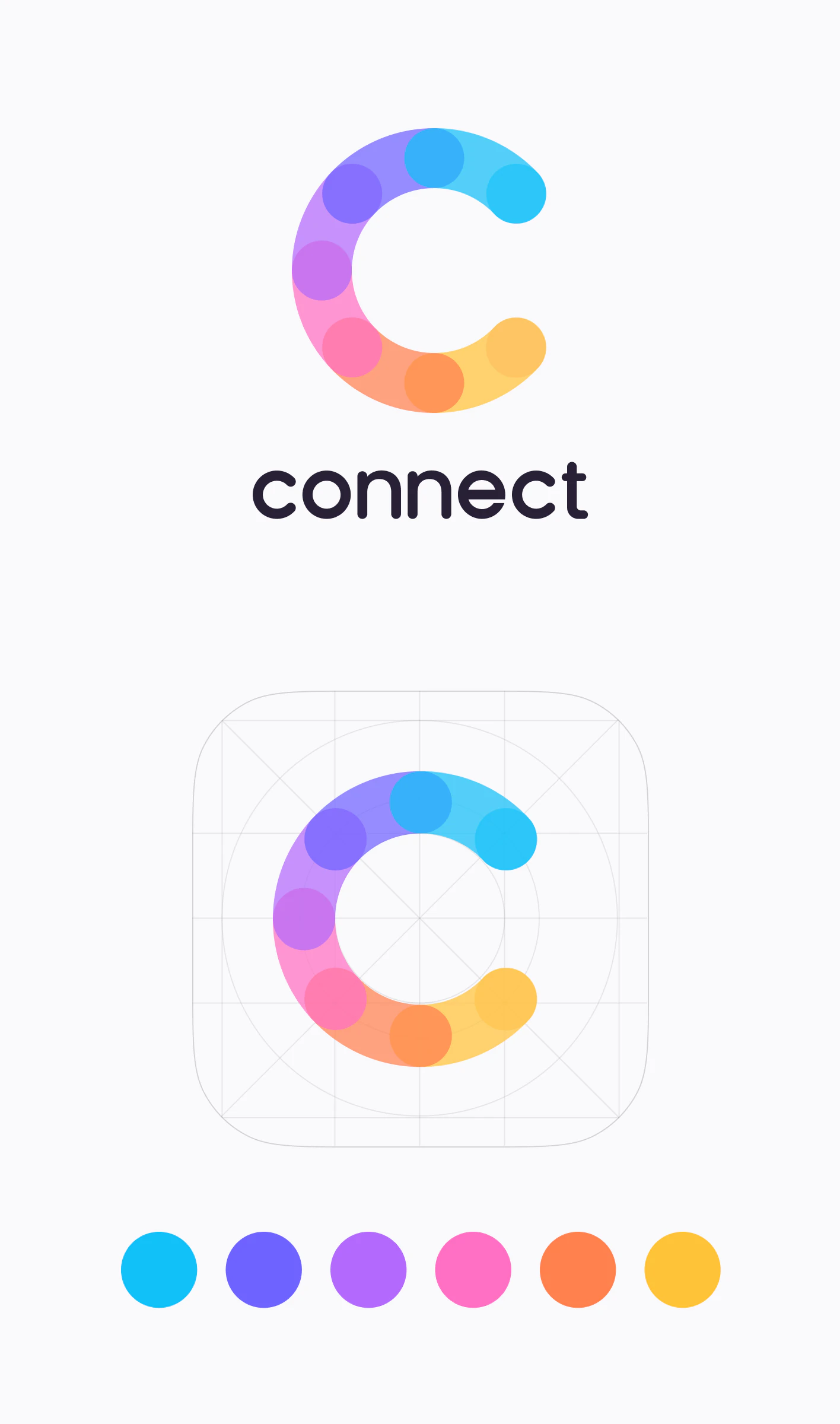
Connect needed an identity that felt warm, open and human without following the usual visual style of social networks.
We developed a distinctive circular mark inspired by connection, supported by expressive colours and approachable typography. The identity gives Connect a recognisable character across the brand and product.
People & Profiles
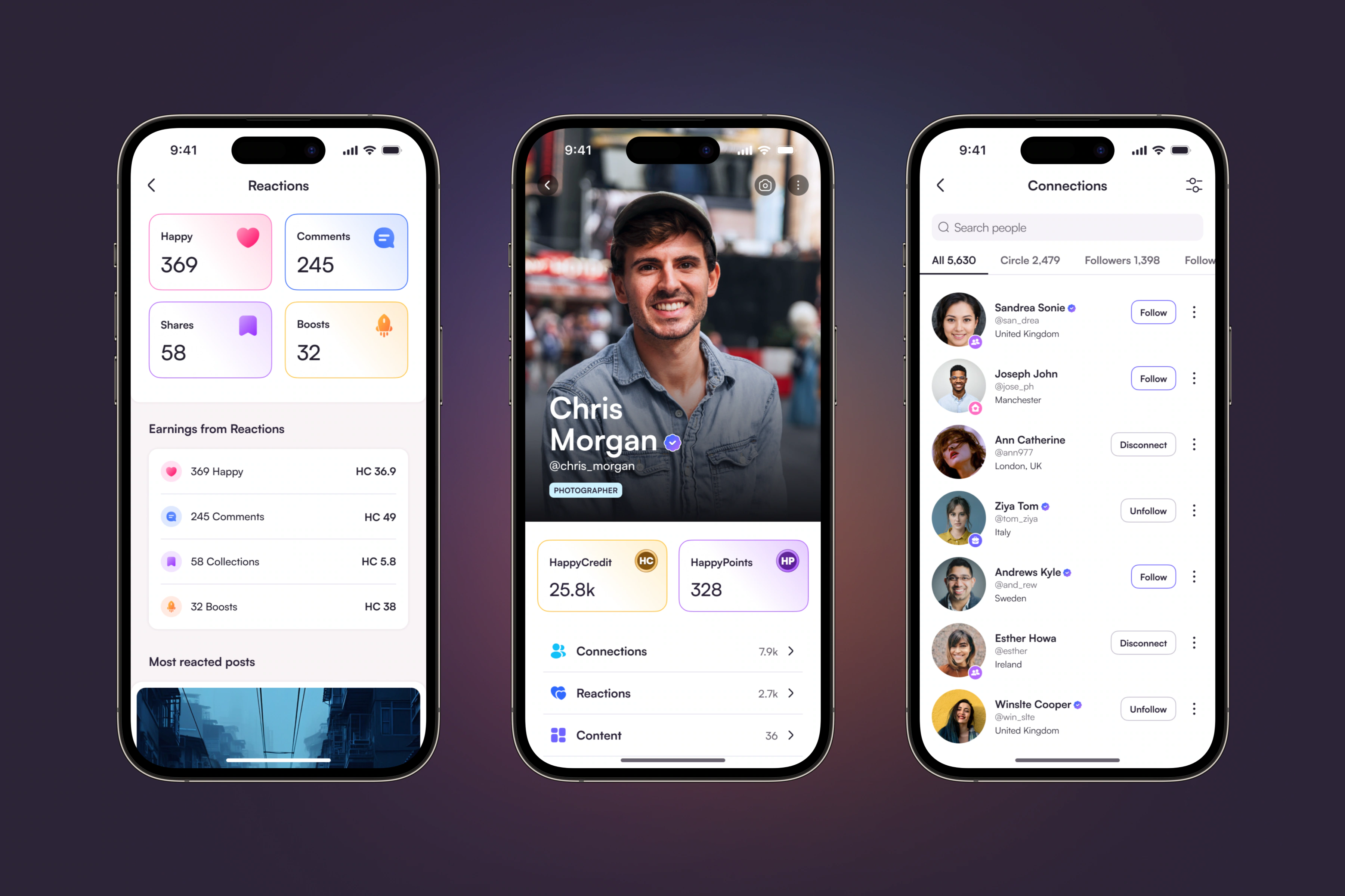
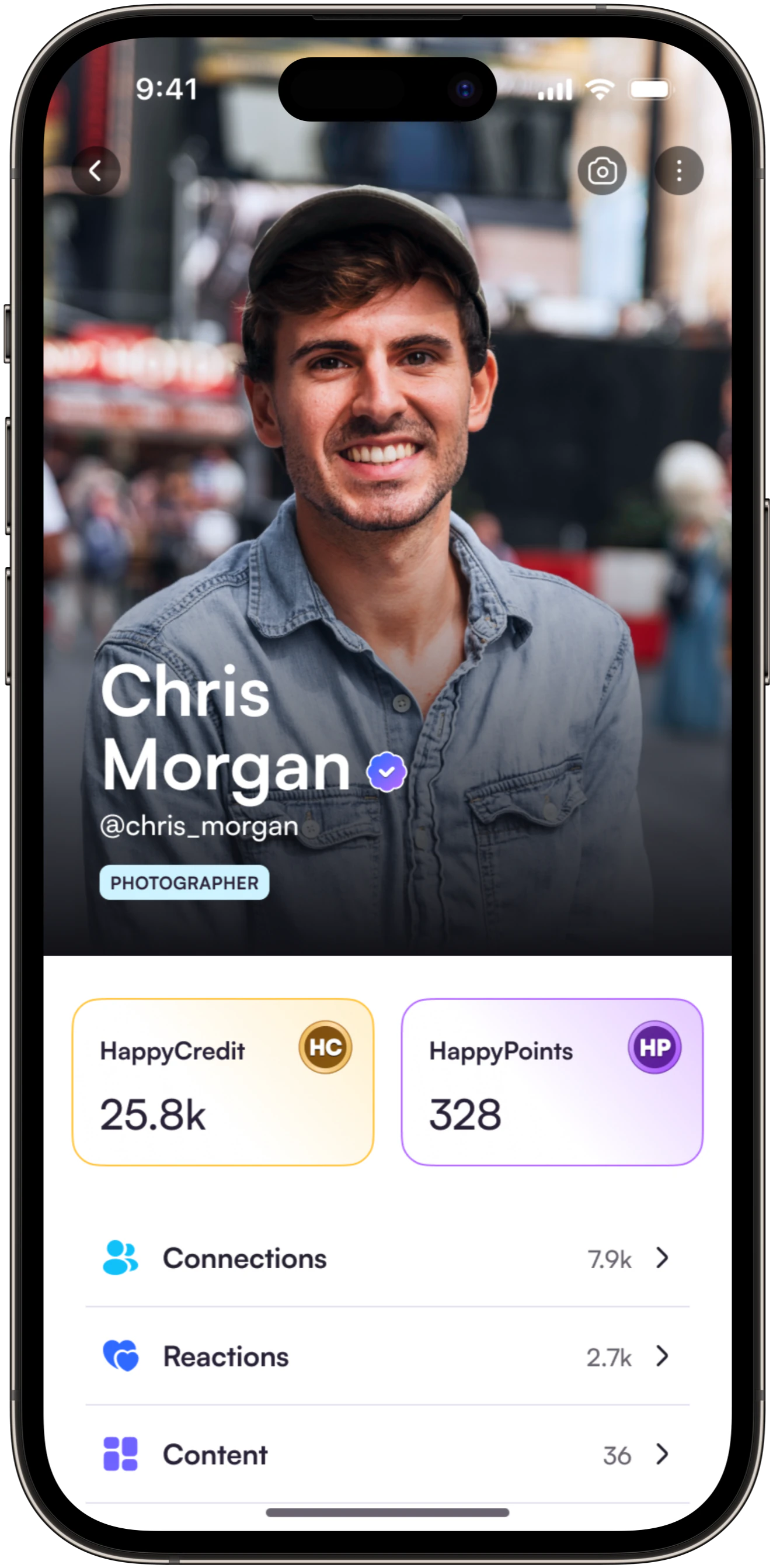
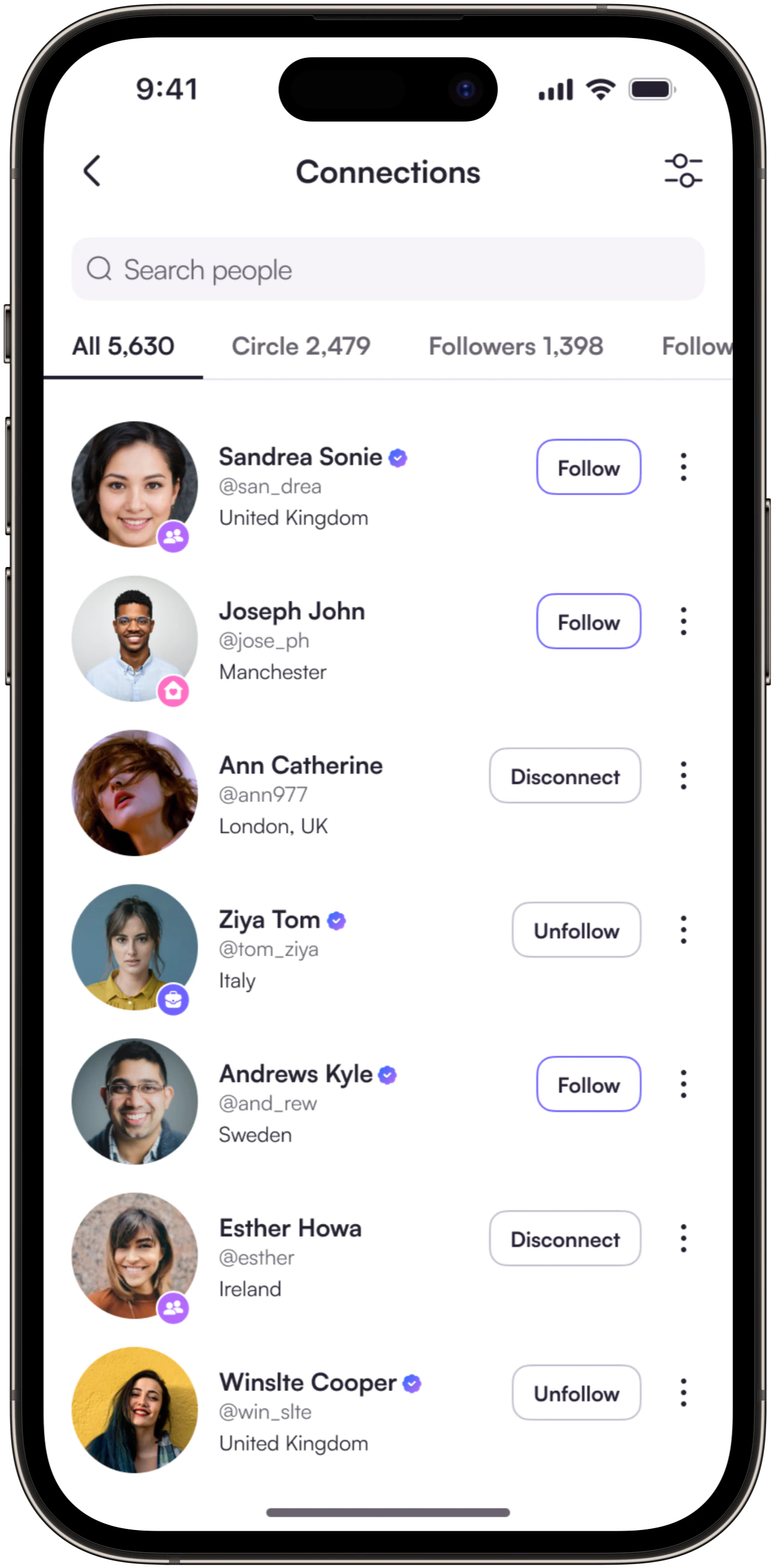
Real connections start with knowing who you're connecting with. Profiles needed to feel personal, trustworthy and easy to explore.
We designed clear profile layouts, familiar social actions and simple ways to interact, making it easier to discover people, share content and build genuine connections.
Real Connections
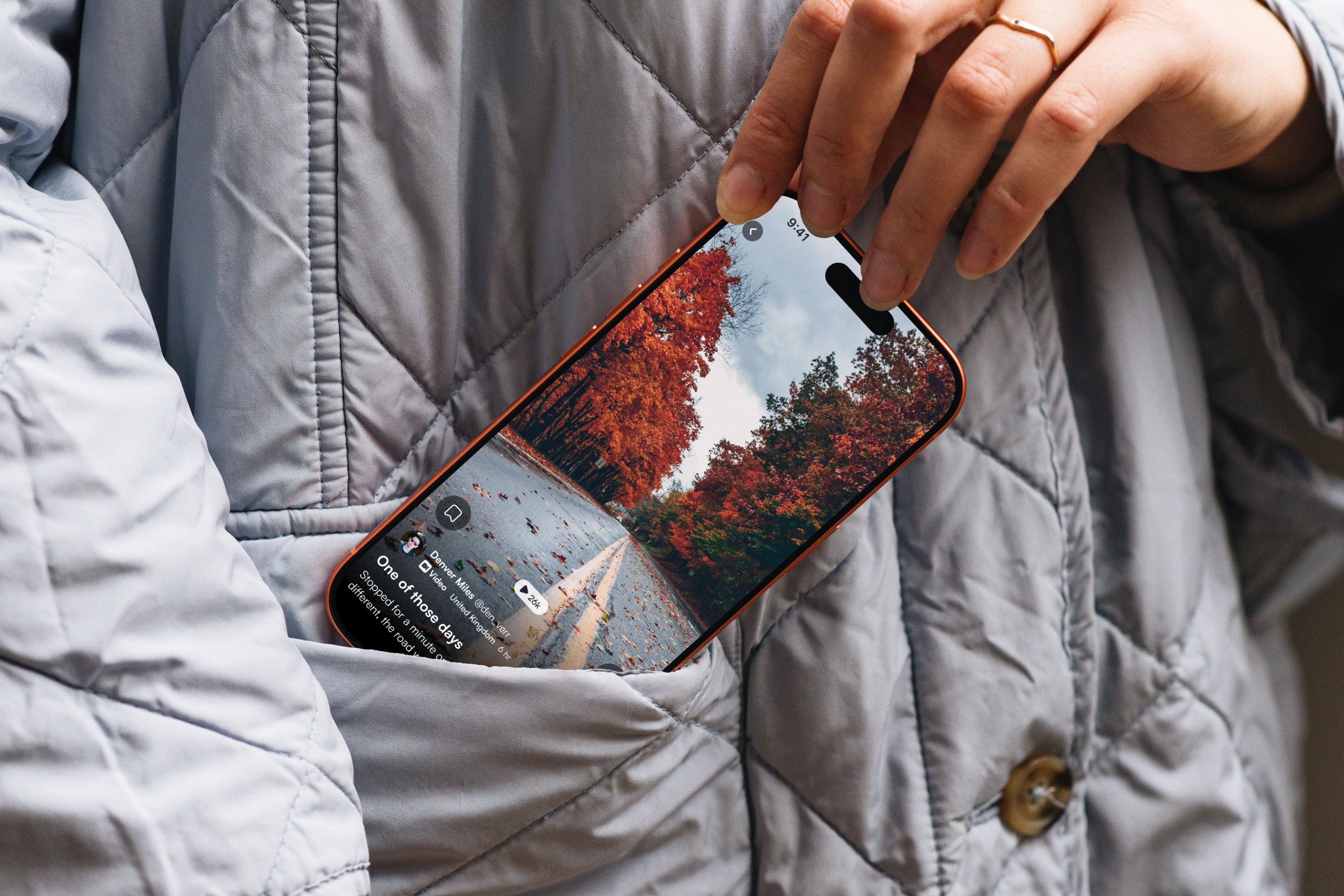
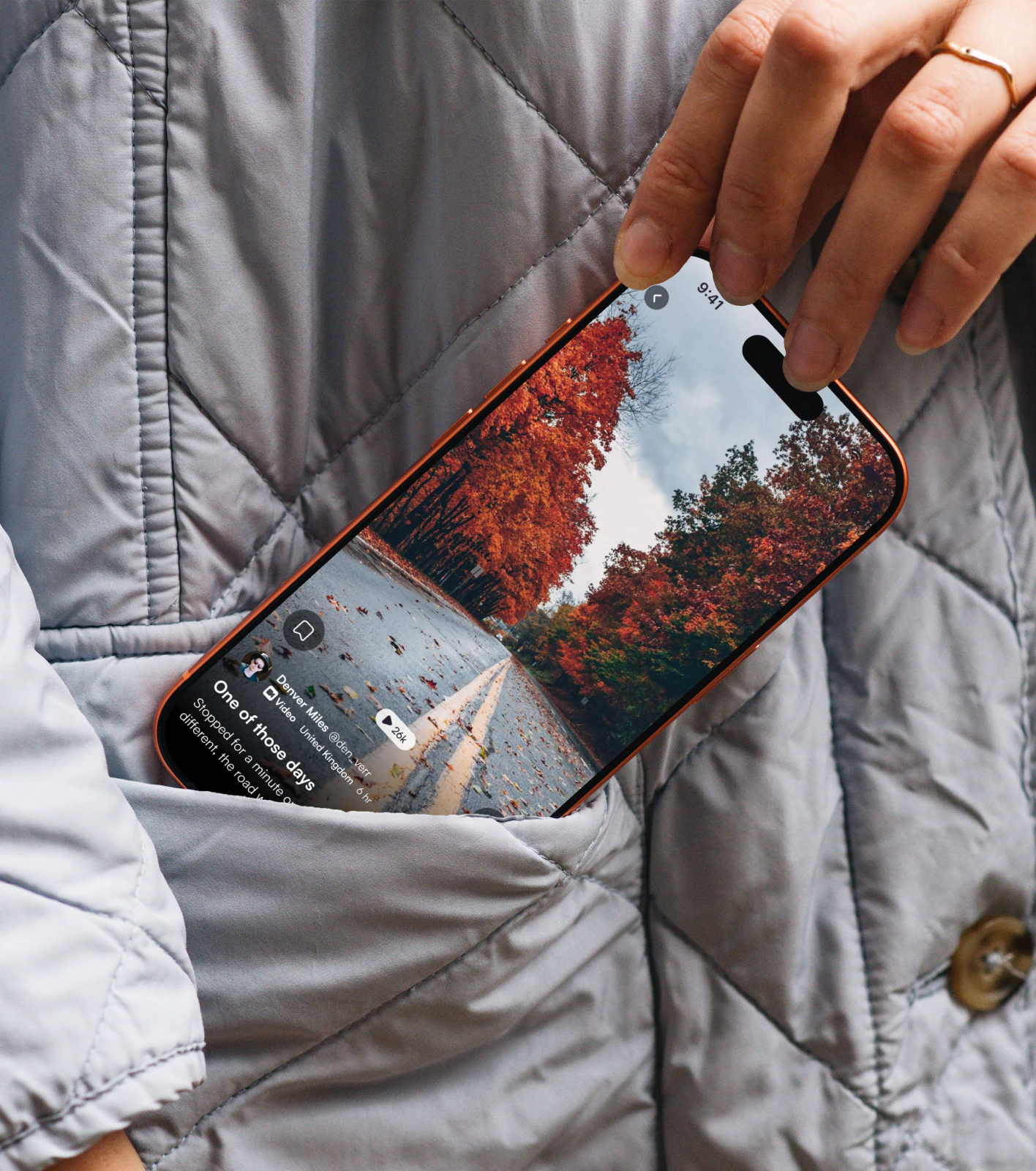
Connect puts real identity at the centre of social interaction, with verified profiles designed to reduce fake accounts and misleading connections.
We focused on making profiles and interactions feel genuine without adding unnecessary verification details to the interface. The experience keeps attention on people and their conversations rather than popularity metrics.
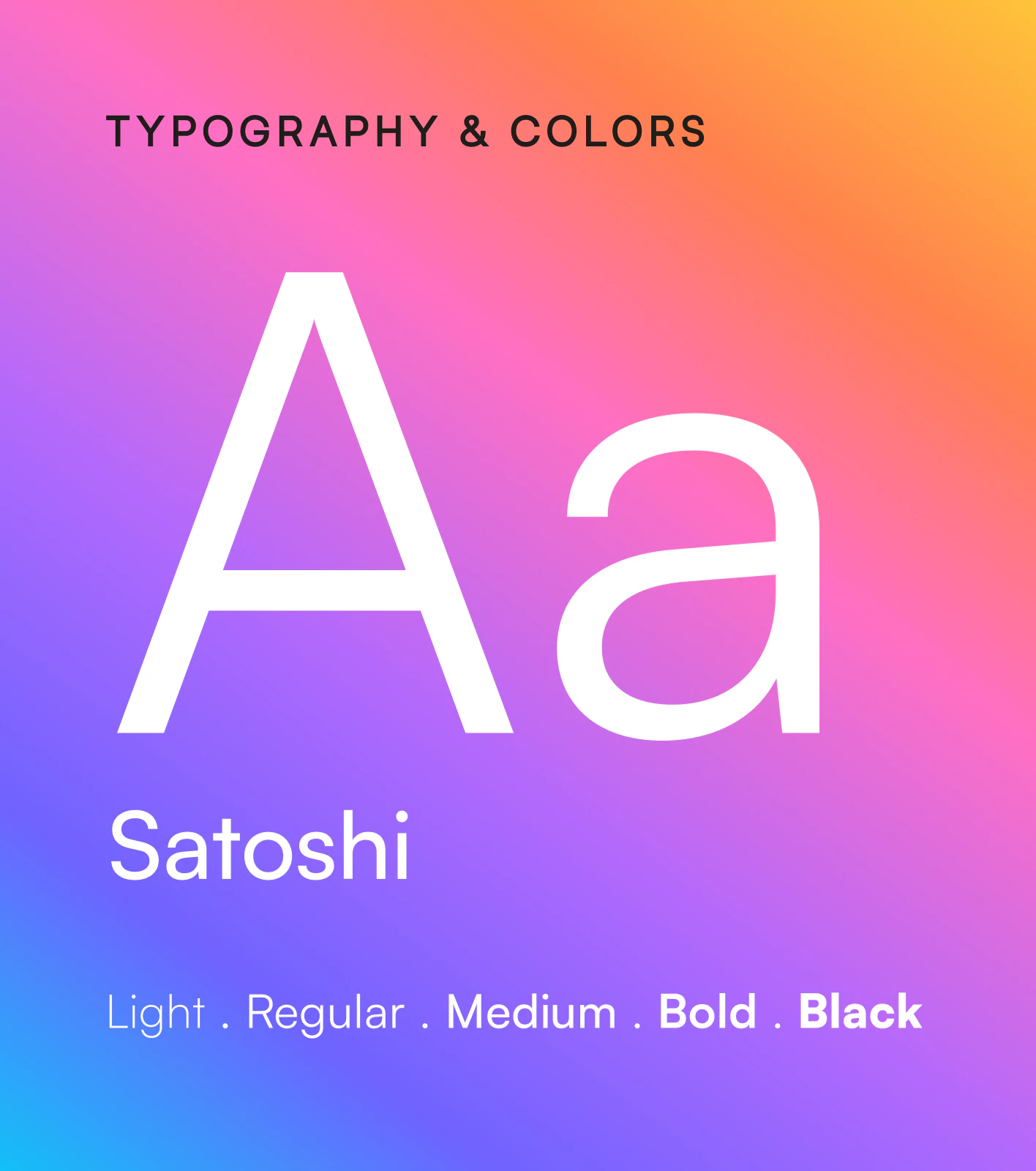
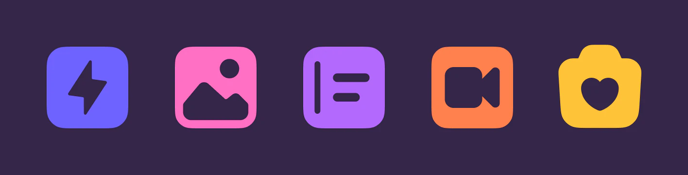
Visual Design
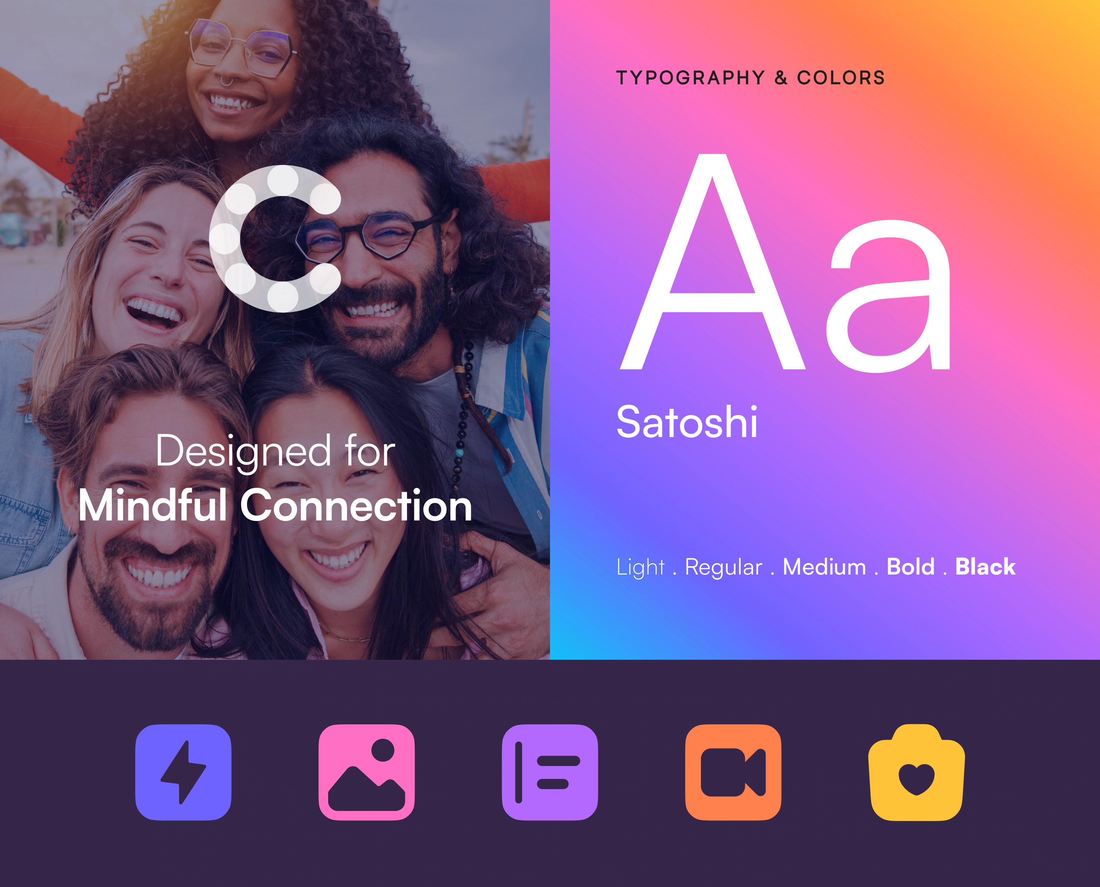
The visual identity needed enough personality to feel welcoming, while remaining consistent across different parts of the app.
We brought together expressive colours, clean typography and simple iconography to create a distinctive visual style. Each element was designed to support the experience without competing with the content people share.
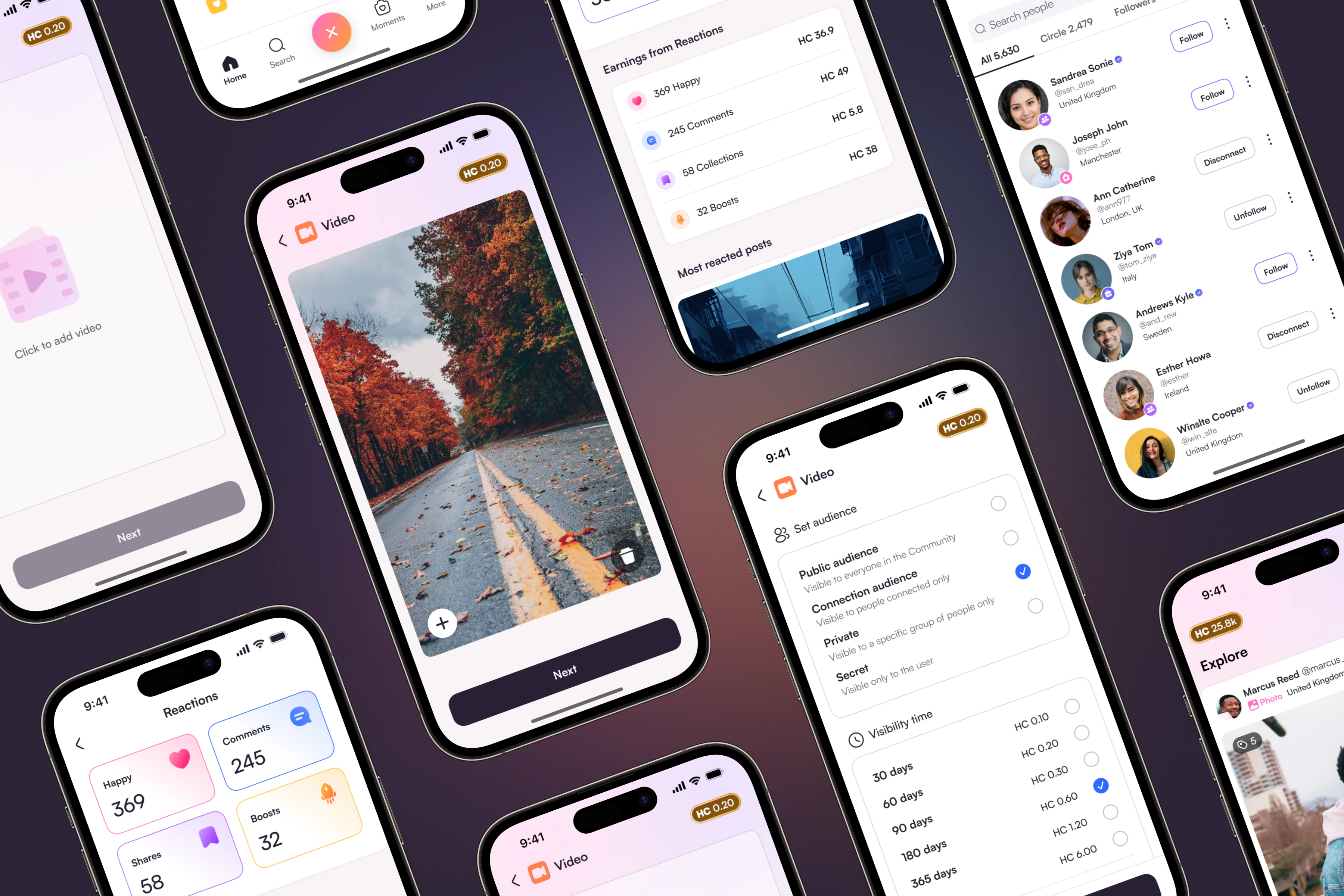
The Outcome
The final direction gives Connect a clearer identity and a more intentional social experience.
By bringing the brand and product together around the same principles, the experience feels familiar enough to use naturally while standing apart through trust, privacy and real connection.
Stay real.Stay close.
A more personal social experience built around trust, privacy and the freedom to connect and share on your own terms.