Overview
Happydemy isn’t just an app.
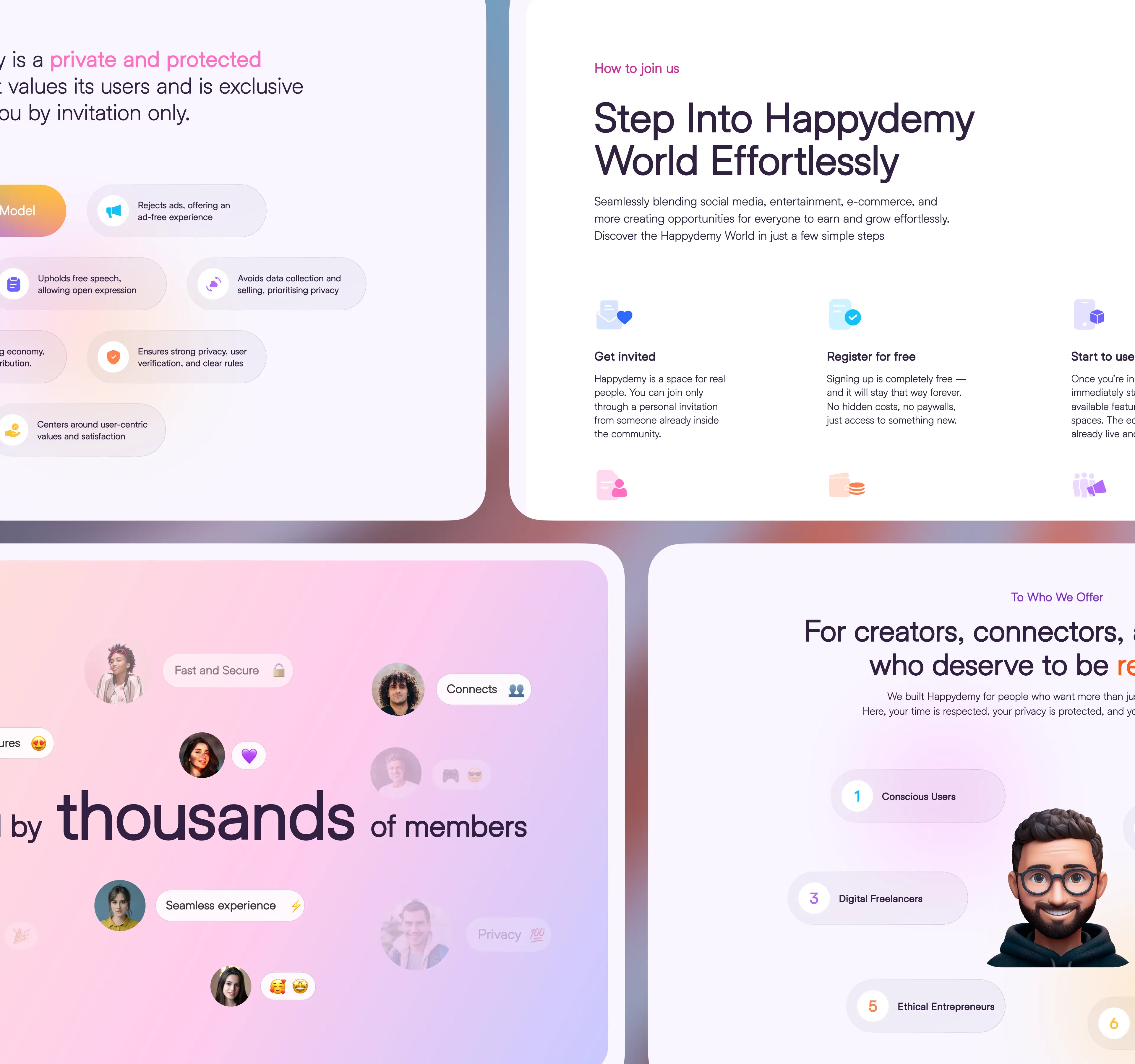
It’s a private digital world where social media, messaging, shopping, entertainment, and productivity all live under one roof. Like a secure, invite-only online country.
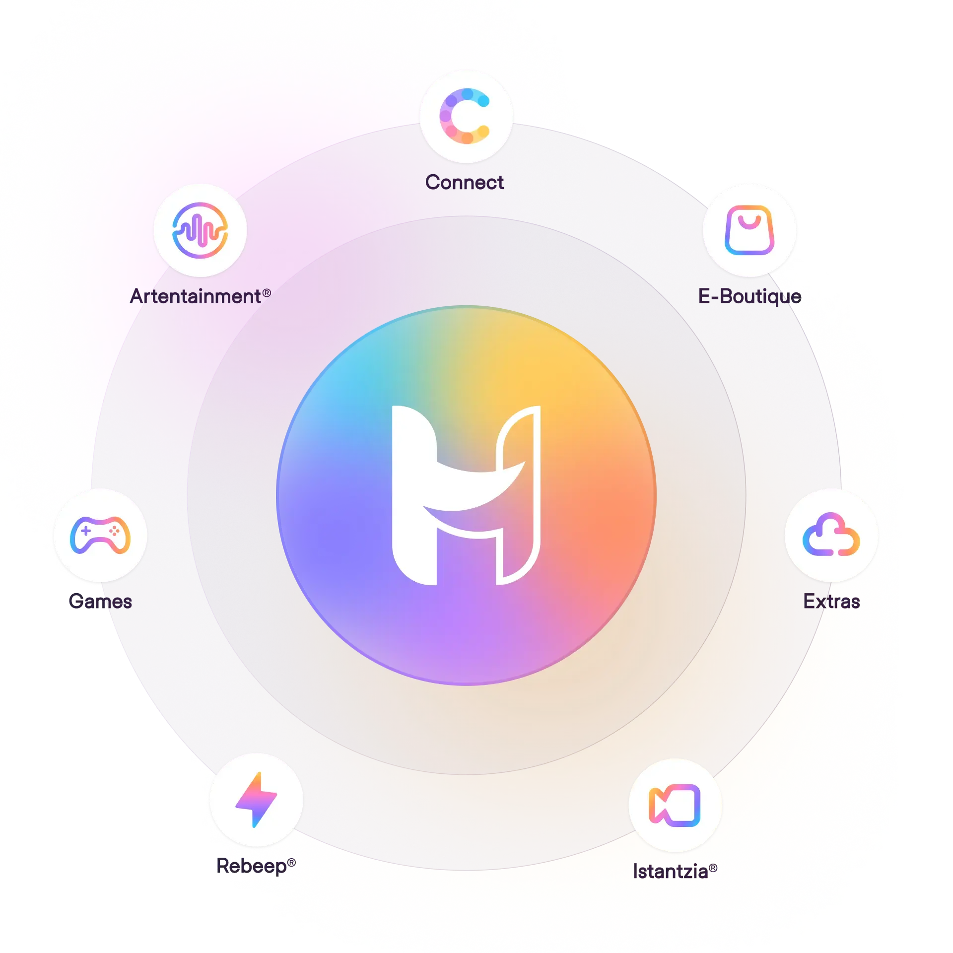
We designed the entire ecosystem - from branding and UI/UX to custom icons, illustrations, and animations - across all 9 connected products.
That includes the central Happydemy app, built to manage everything in one place. One login. Full control. Total harmony.
Our Role
A Fully Designed Ecosystem
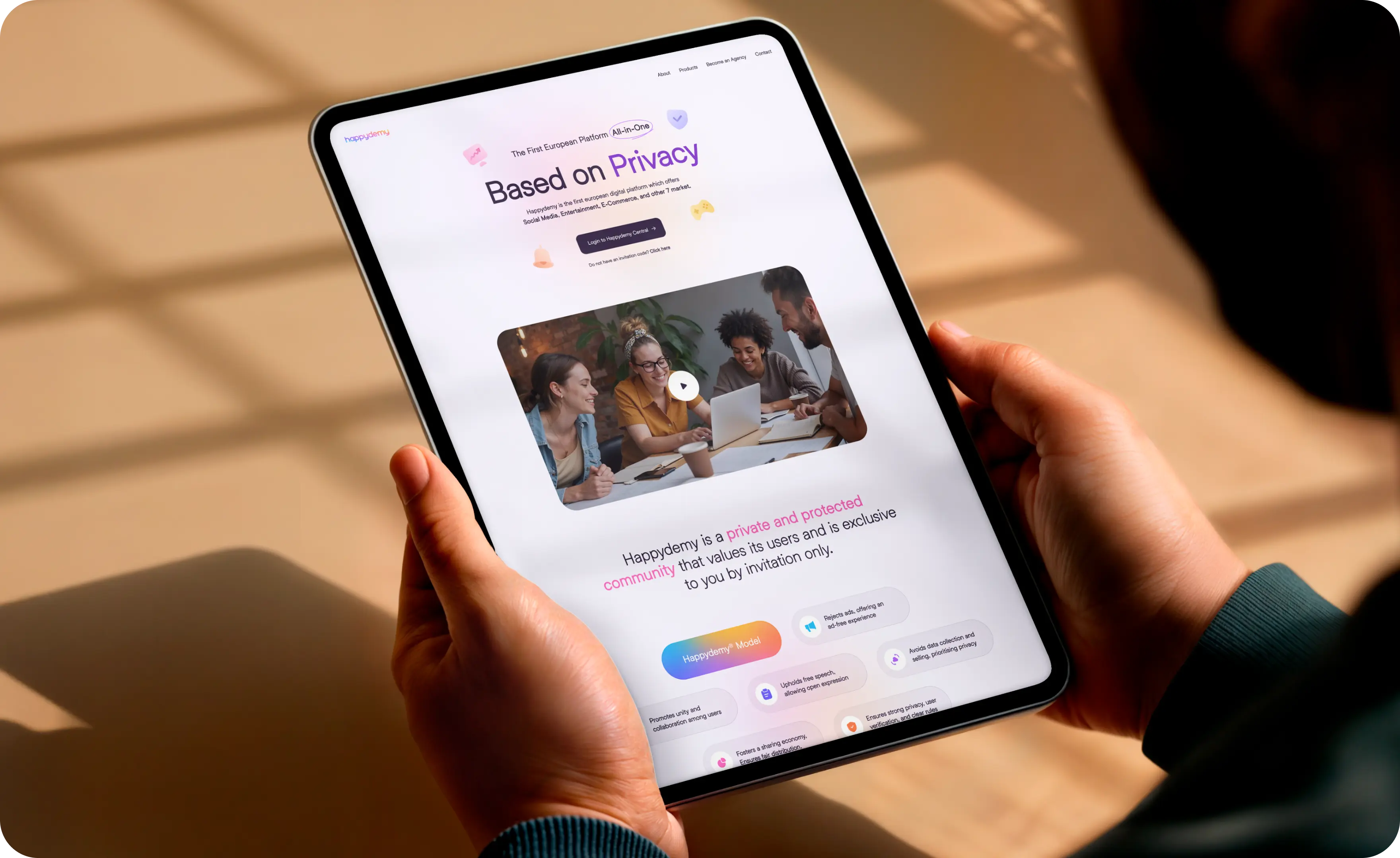
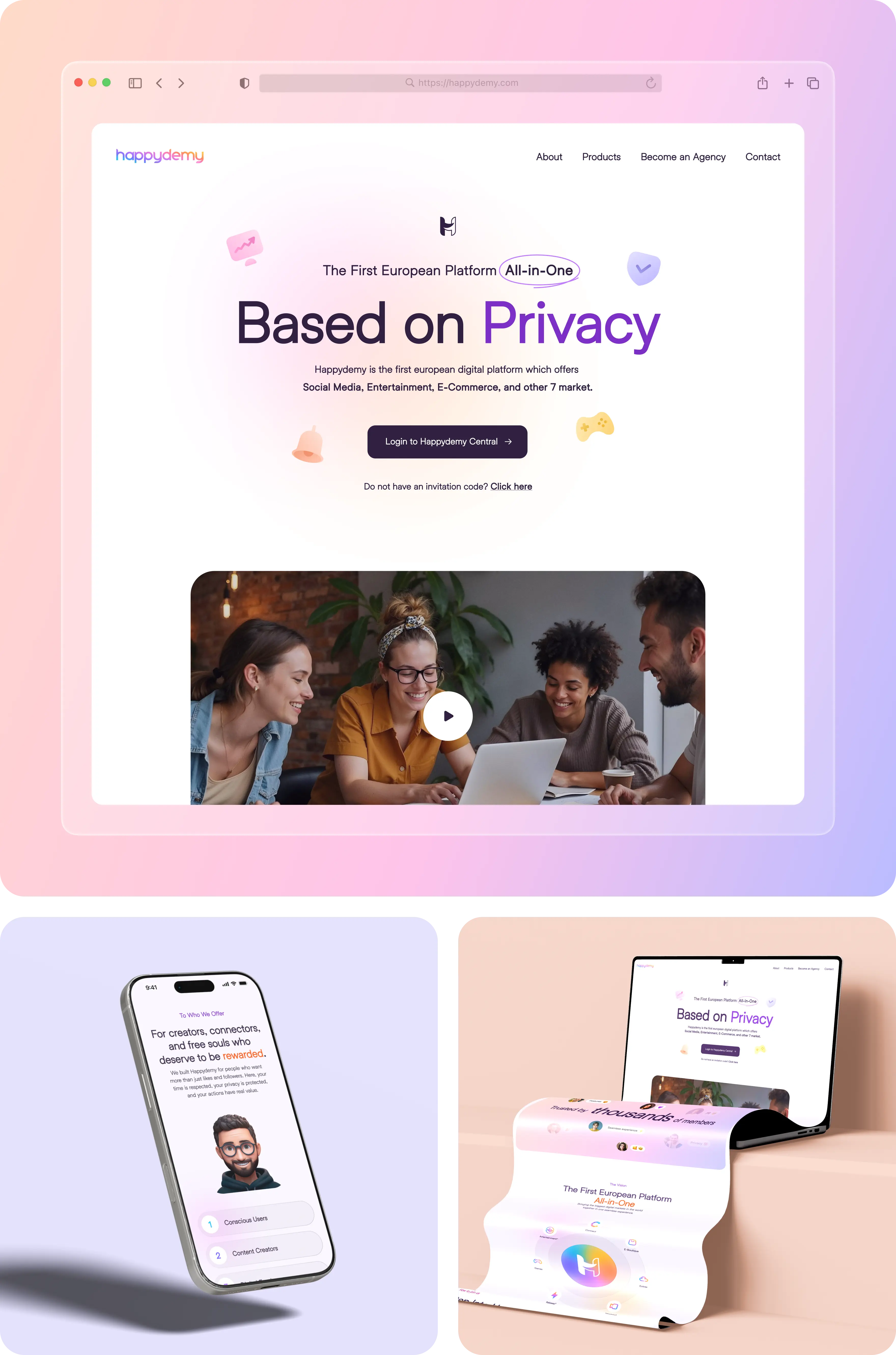
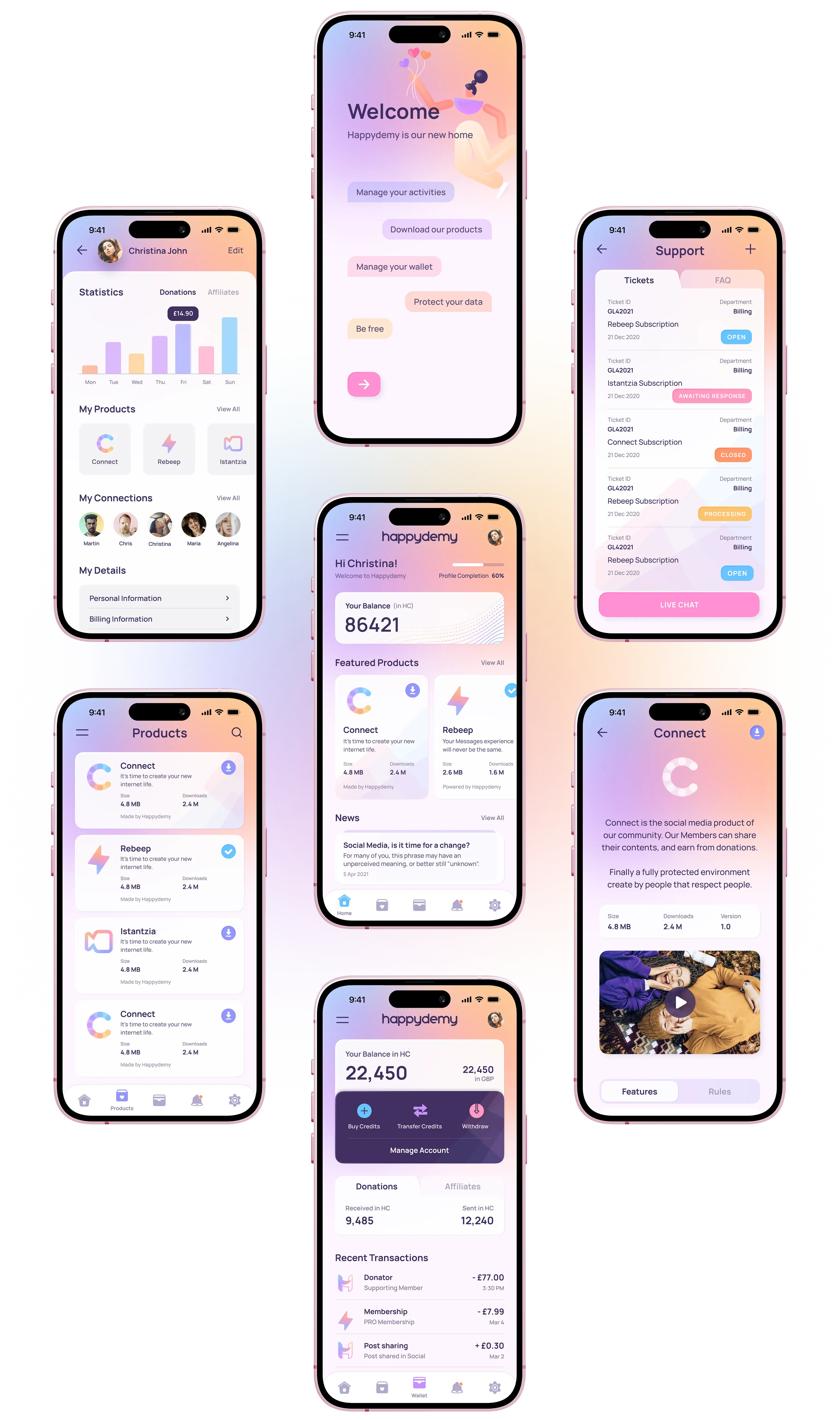
We led the full visual direction for the Happydemy platform, covering everything from brand identity to product design. The aim was to create a look that felt fresh, friendly, and consistent everywhere.
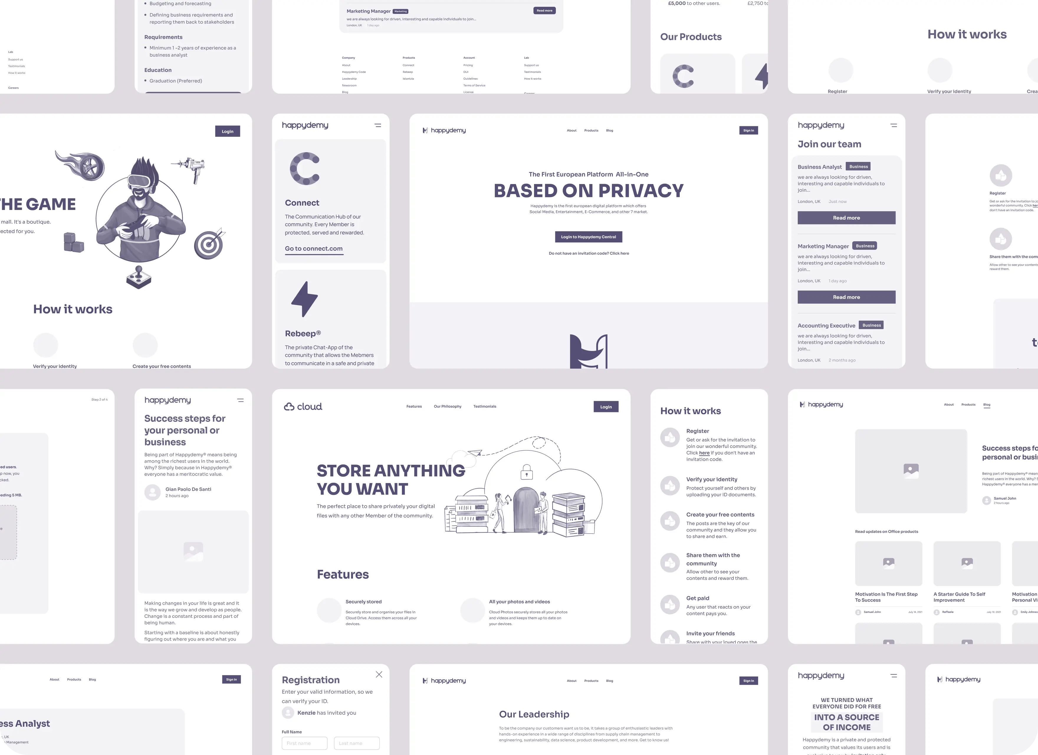
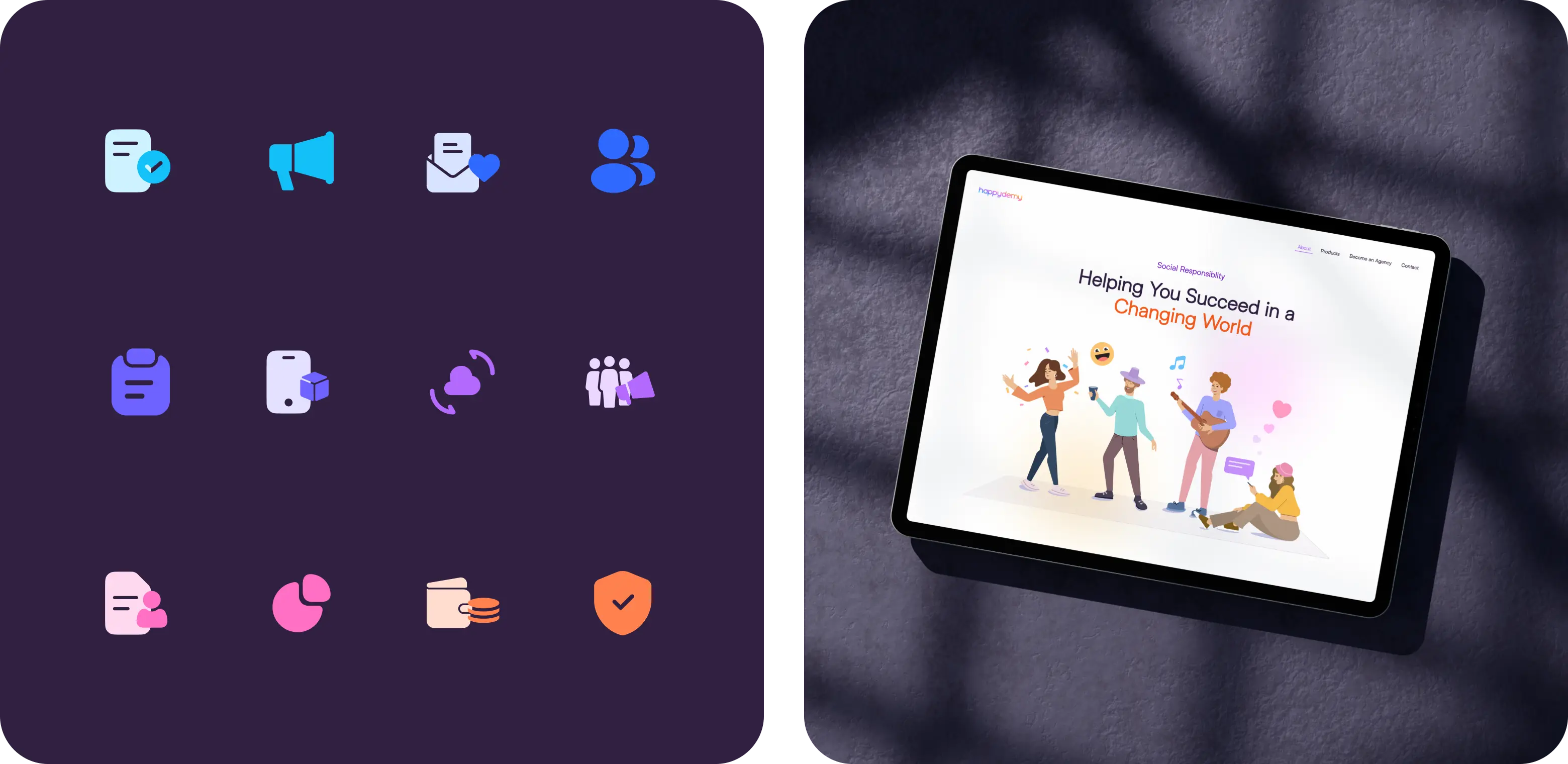
This included UI and UX for web and mobile, custom icons, playful illustrations, and animations for both in app and marketing use. Every piece was built to feel part of the same system.
From first tap to final screen, the experience stays clear and familiar. Every detail works together to reflect the same design voice across the entire platform.
- Brand identity Logo, colors, typography, and tone - built to unify the entire platform.
- UI/UX for web and mobile Designed all web and mobile screens in Figma with a consistent, user-friendly system.
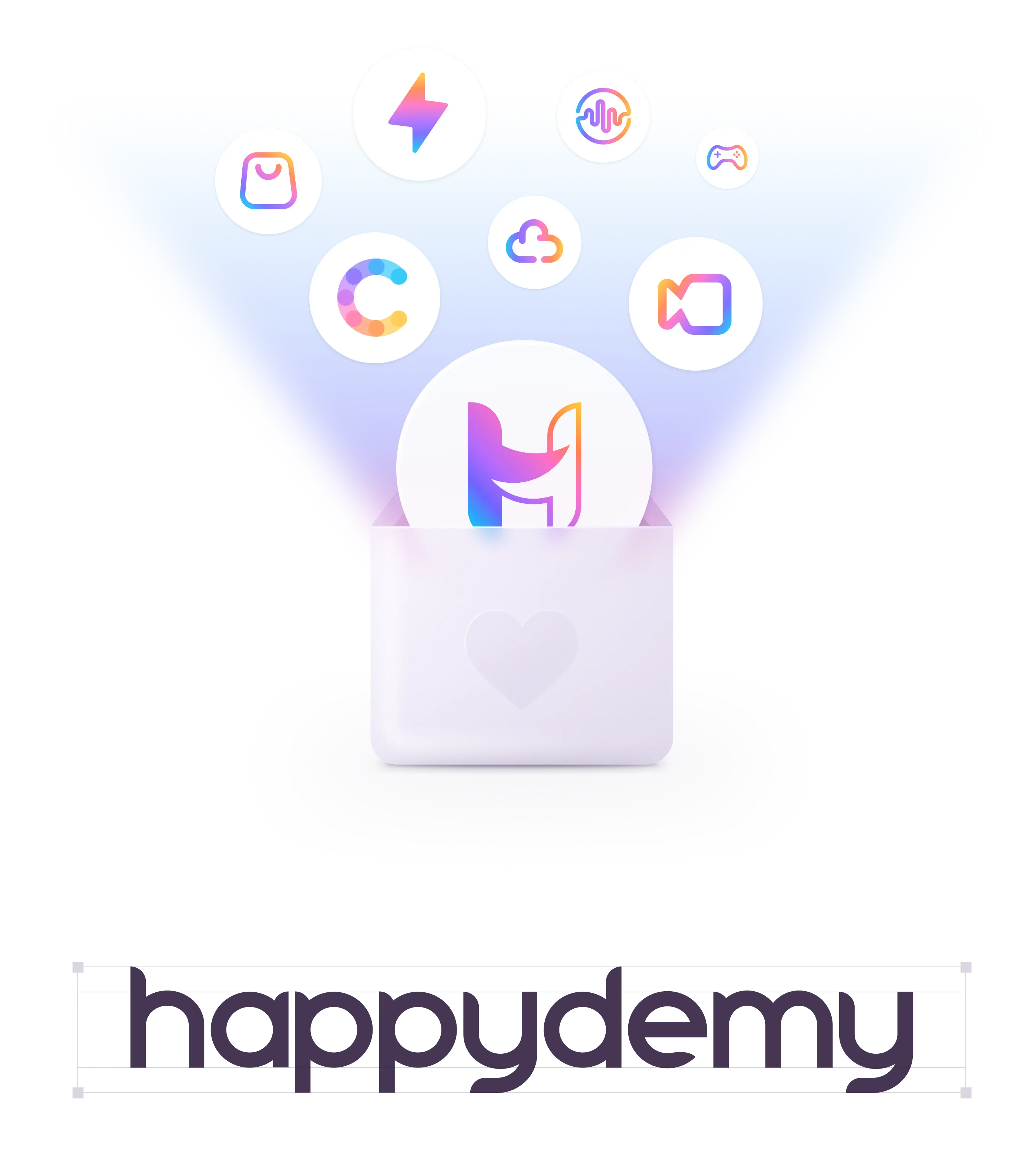
- Icons and Illustrations Custom sets that add personality while keeping the ecosystem cohesive.
- Explainer Videos and Animations Marketing videos and in-app animations to promote, guide, and enhance the experience.
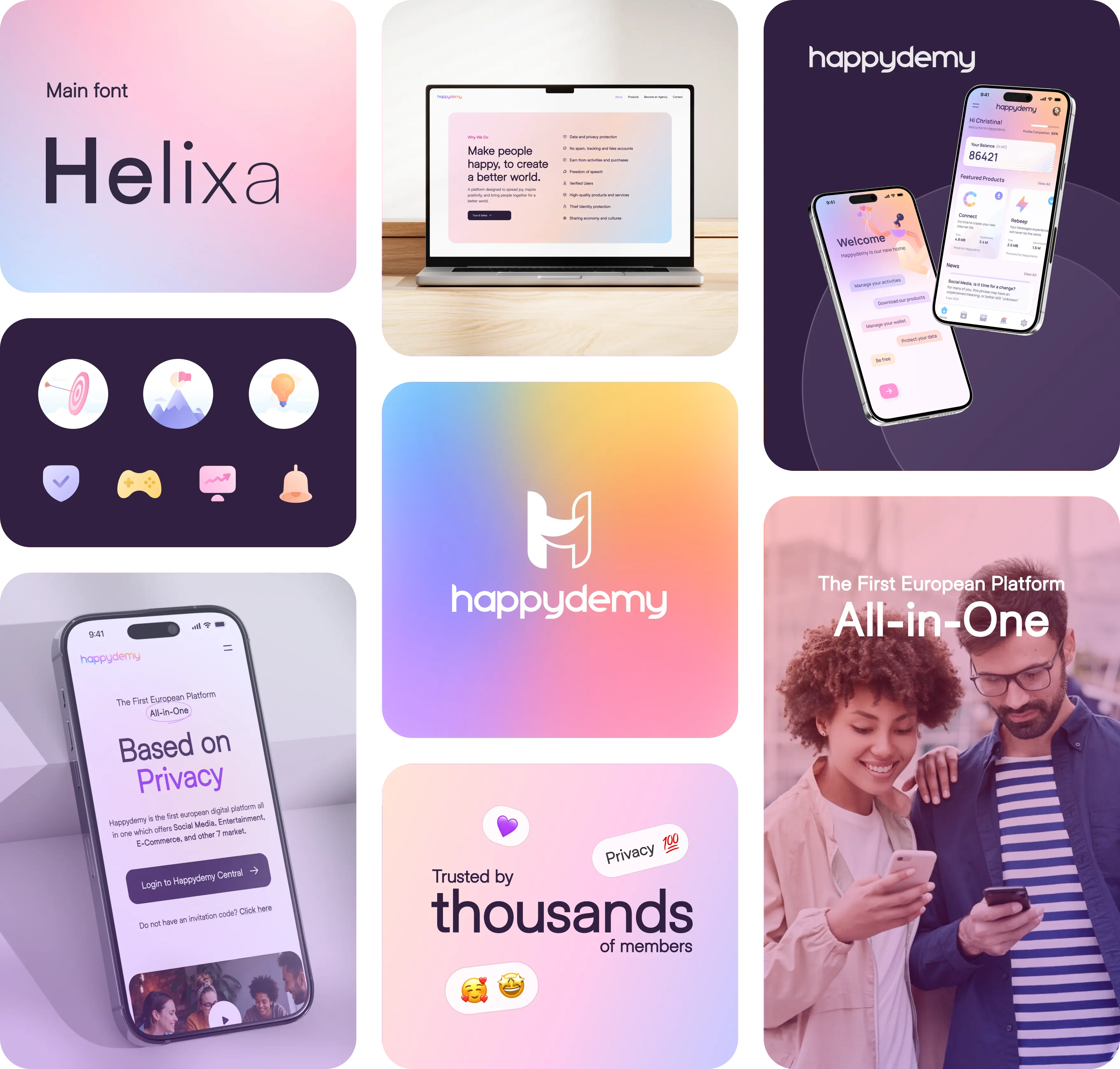
Unified Branding
One unified brand style, applied with clarity and consistency across every product and touchpoint.
Design System
Modern interfaces built using UX principles that emphasize clarity, ease, and genuine delight.
The Impact
Modern UX, built from the ground up.
What we created wasn’t just a good looking interface. It was a full product experience designed to feel intuitive from the first tap. With no design in place, every screen and flow had to be built from scratch - giving us the freedom to focus on what users actually need.
We made sure everything felt connected, from how people join and explore content to how creators run sessions and share ideas.
The result is a platform that feels simple, smart, and enjoyable to use, backed by a design system the team can rely on as they grow.
- A Brand That Feels Right A complete visual identity shaped to feel modern, friendly, and creator-focused.
- Thoughtful User Journeys Every flow was planned, so nothing feels random or confusing.
- UI That Gets Out of the Way Clean layouts and clear hierarchy put content front and center.
- Usability Comes First Easy to read, easy to use, and everything’s right where it should be.
- Micro-Interactions That Help Subtle animations brought the UI to life and guided key actions.