Artisanalluxury,reimagined
Blending artisanal craft with a modern, considered brand expression.
Crafted withPurpose
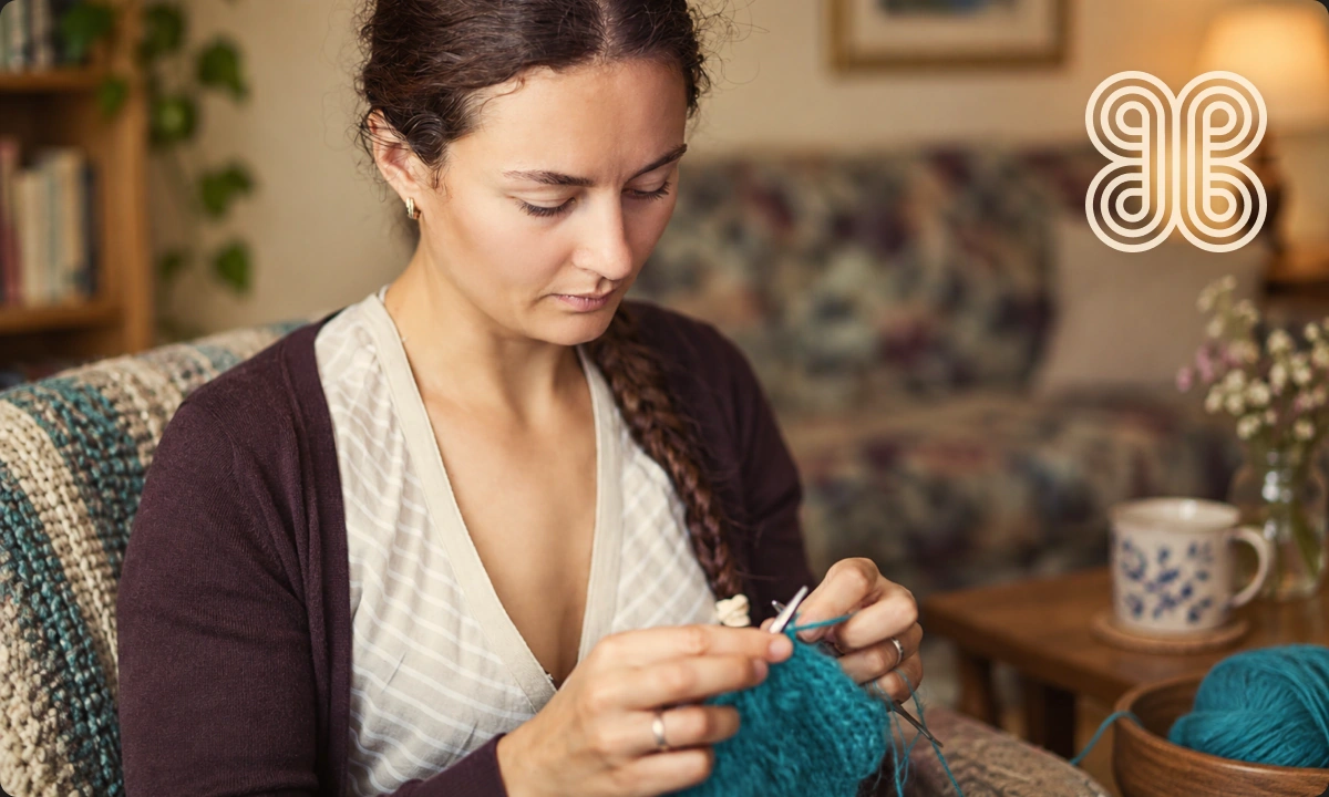
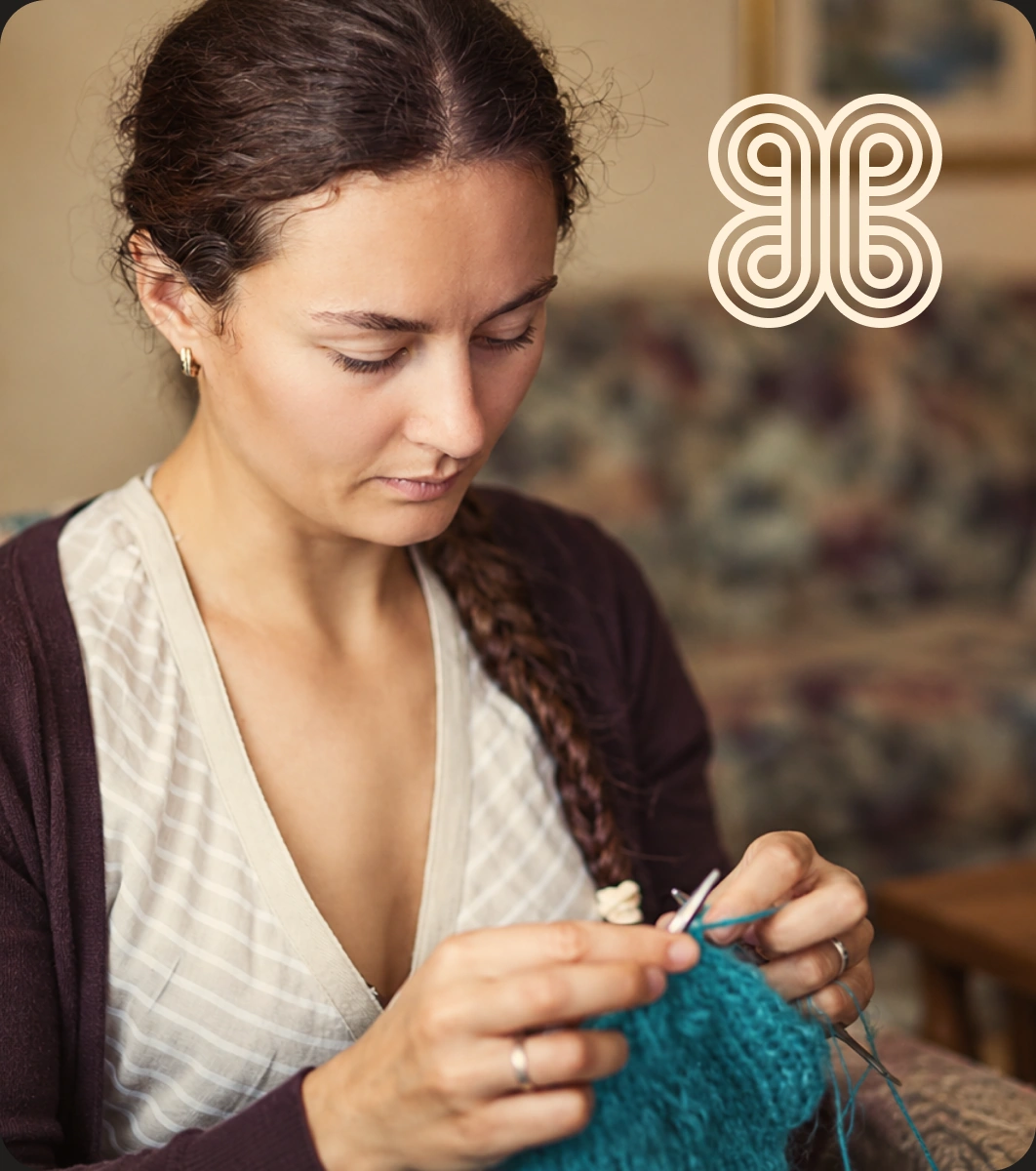
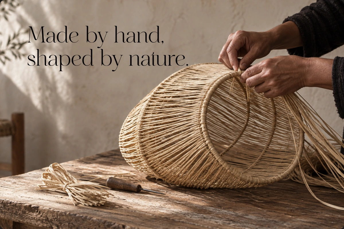
HibbaBottega is built around the idea of Artisanal Intelligence: bringing human craftsmanship and thoughtful design together with purpose.
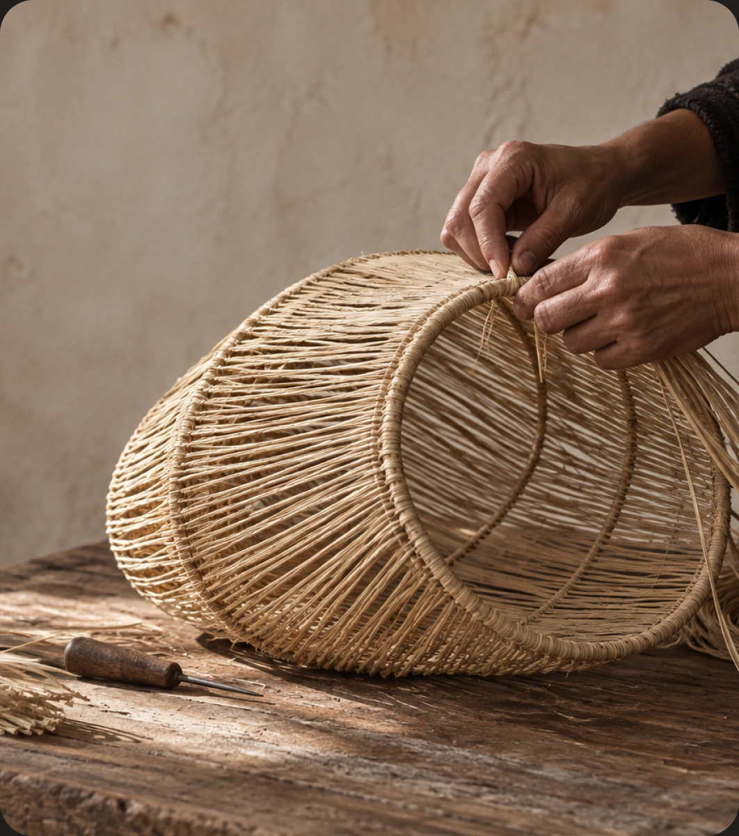
The brand celebrates objects made with care, where material, authenticity and intention matter more than speed or mass production. Our role was to translate that philosophy into a refined identity that feels contemporary without losing the warmth and character of handmade work.
- Location
- Switzerland
- Scope
- Brand IdentityDigital Direction
- Sector
- LuxuryLifestyle
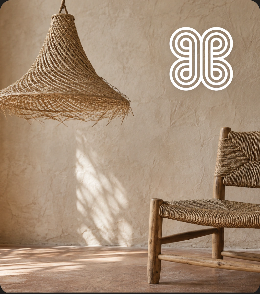
Craft,Reframed
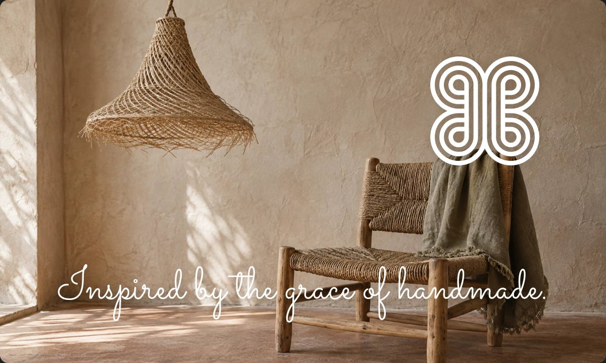
The challenge was to express the value of traditional craft without making the brand feel old-fashioned or overly rustic.
We focused on finding a visual balance between heritage and modernity, using restraint, proportion and material-led details to create a brand that feels elevated while staying close to the people and processes behind each piece.
Identity withCharacter
The identity needed to feel distinctive without becoming decorative.
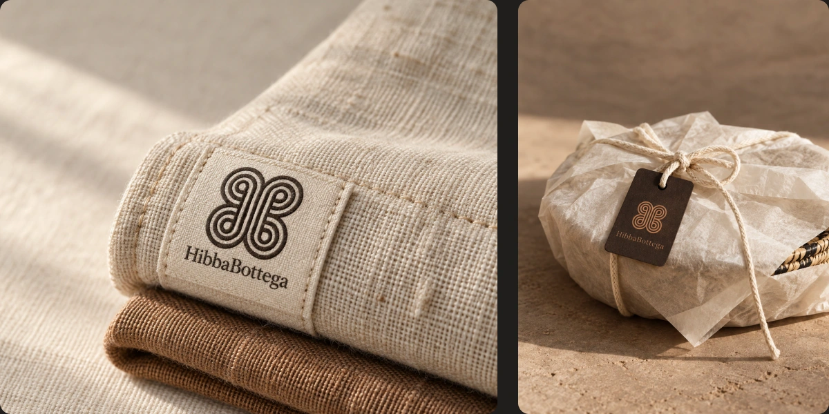
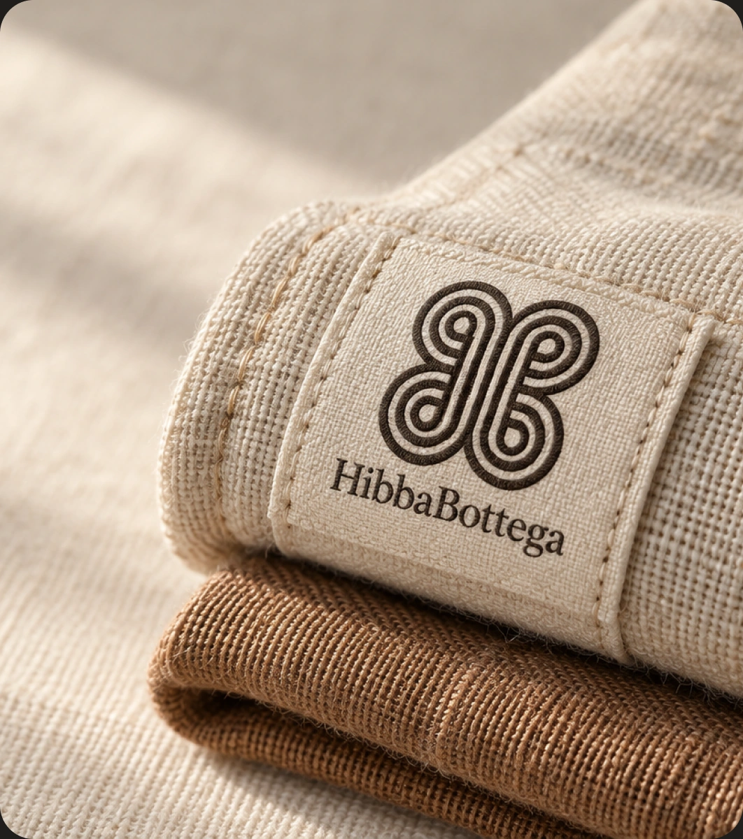
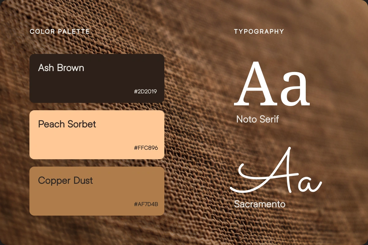
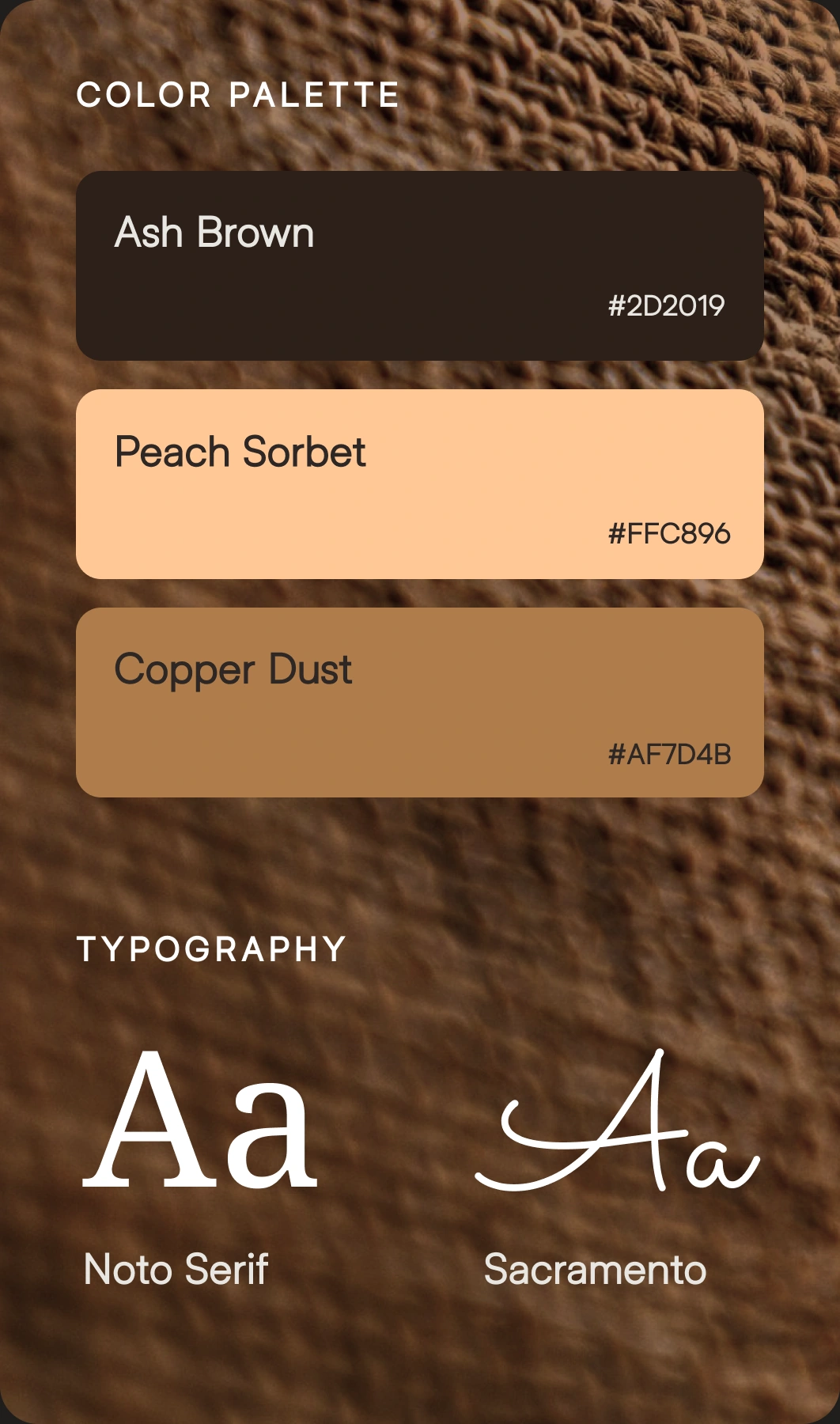
We developed a visual system around warm, earthy tones, refined typography and a mark inspired by woven forms. The result is a brand language that feels quiet, tactile and recognisable across packaging, digital and physical touchpoints.
Woven intothe Mark
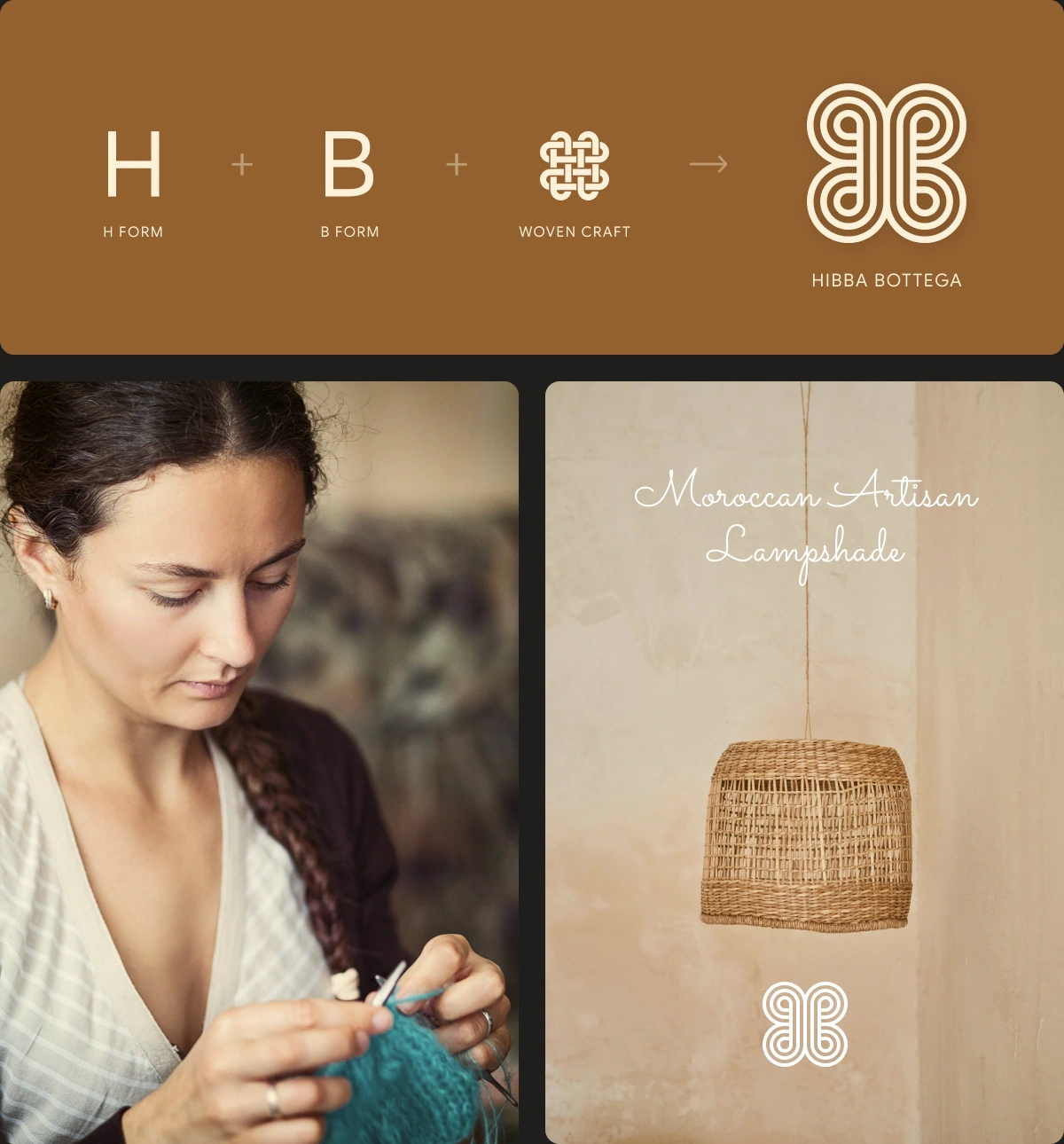
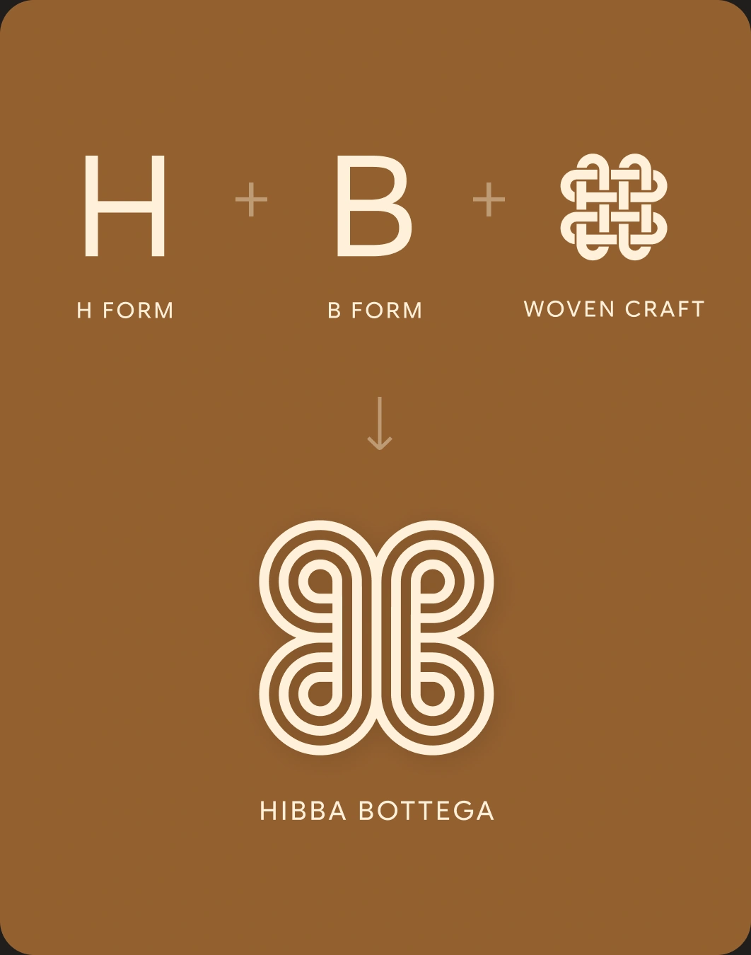
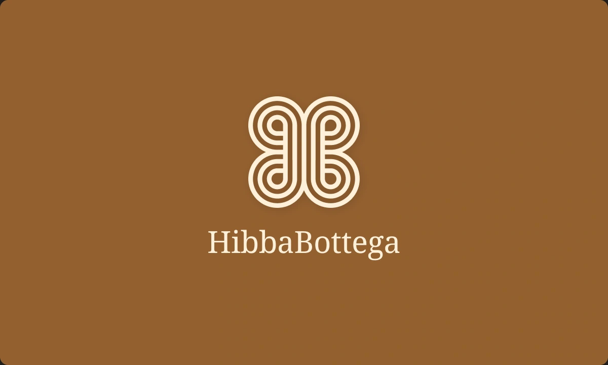
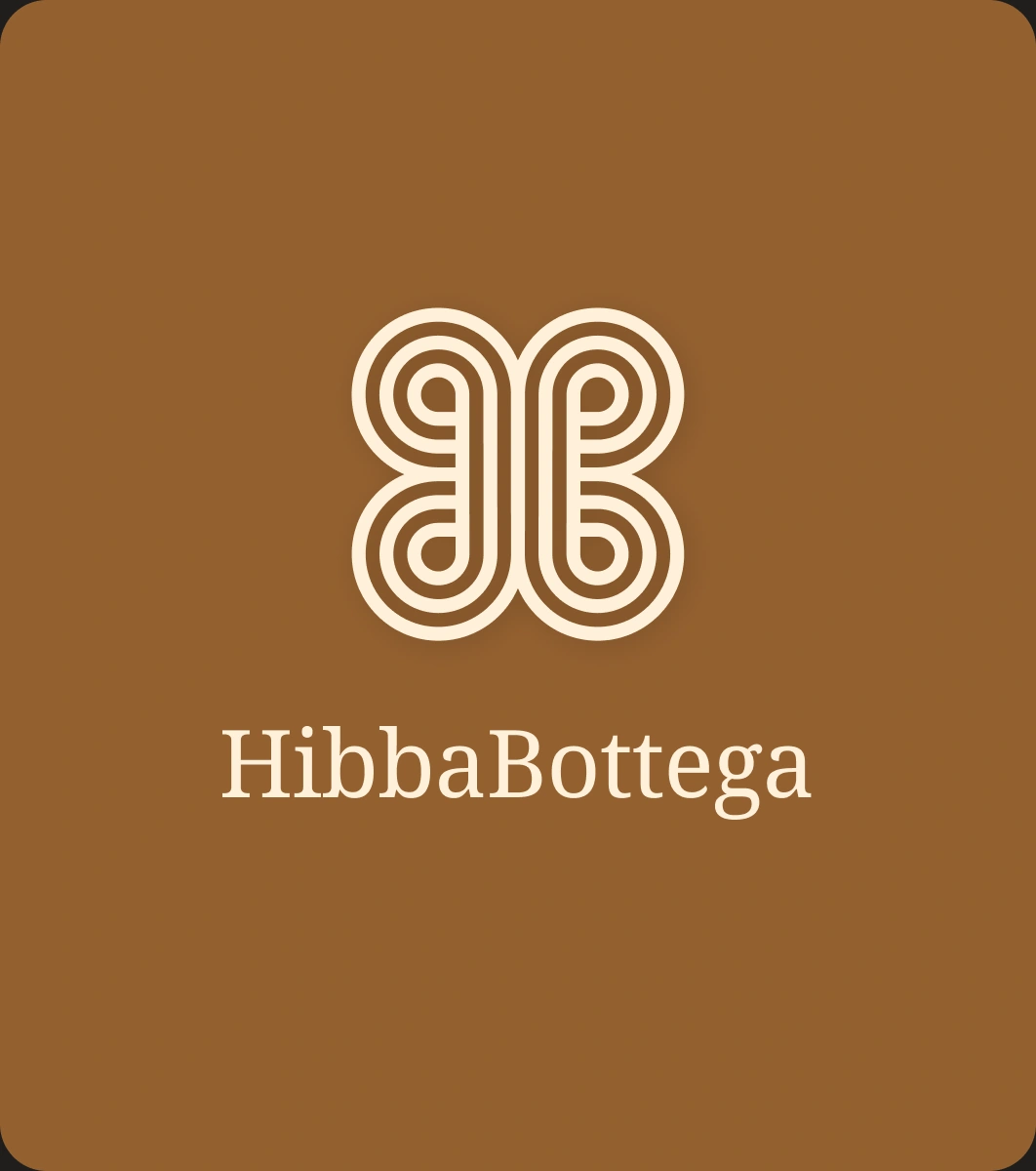
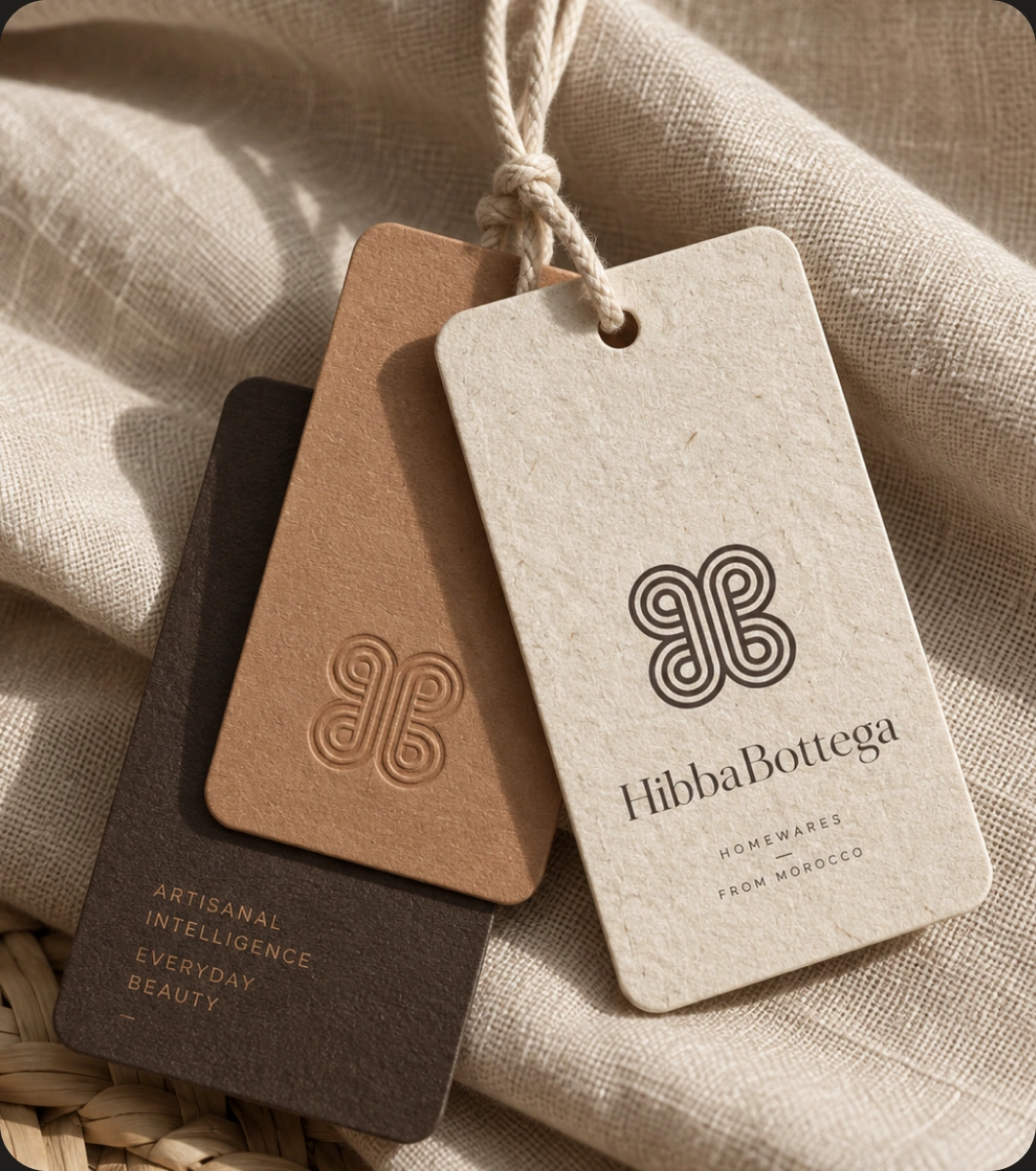
The logo brings together the initials H and B with a woven structure inspired by traditional handcraft.
Its interlocking form creates a sense of rhythm and connection, while the rounded geometry keeps the symbol contemporary and approachable. The mark was designed to feel equally at home on a label, a digital screen or a crafted object.
Quiet byDesign
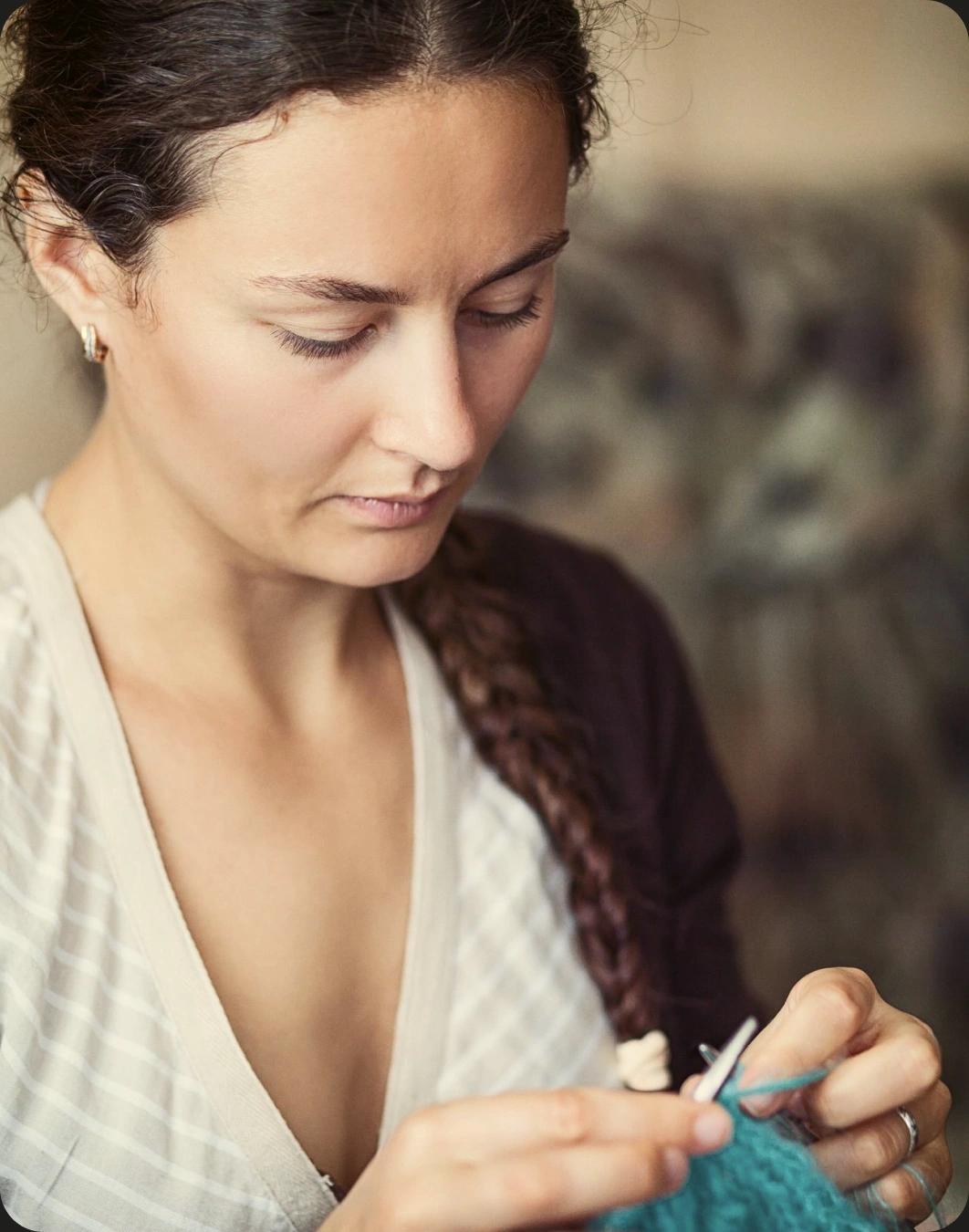
HibbaBottega does not need to shout to feel premium.
We kept the layouts open, the colour palette restrained and the typography measured, allowing the products and craftsmanship to carry most of the visual weight.
This quieter approach helps the brand feel more enduring and less trend-driven.
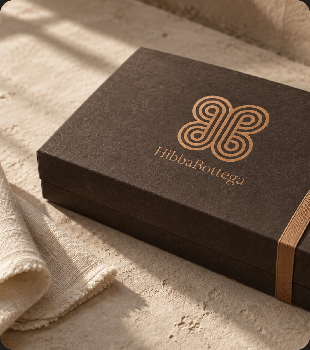
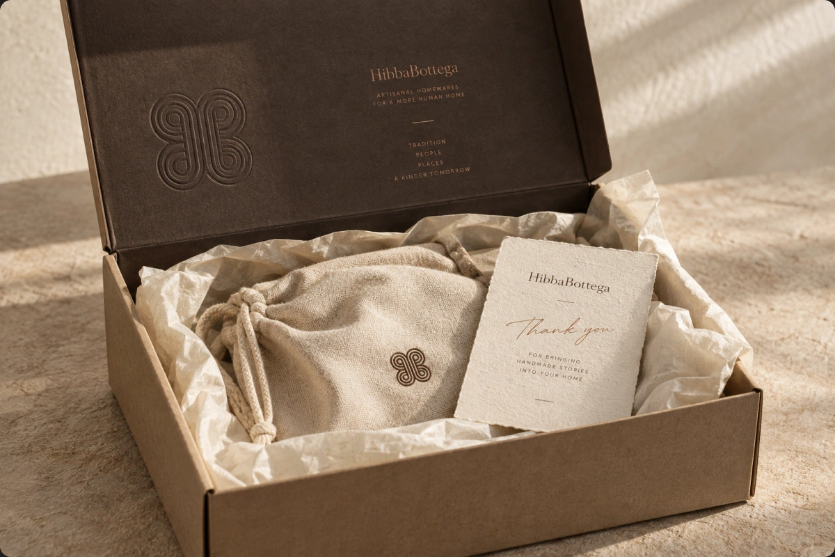
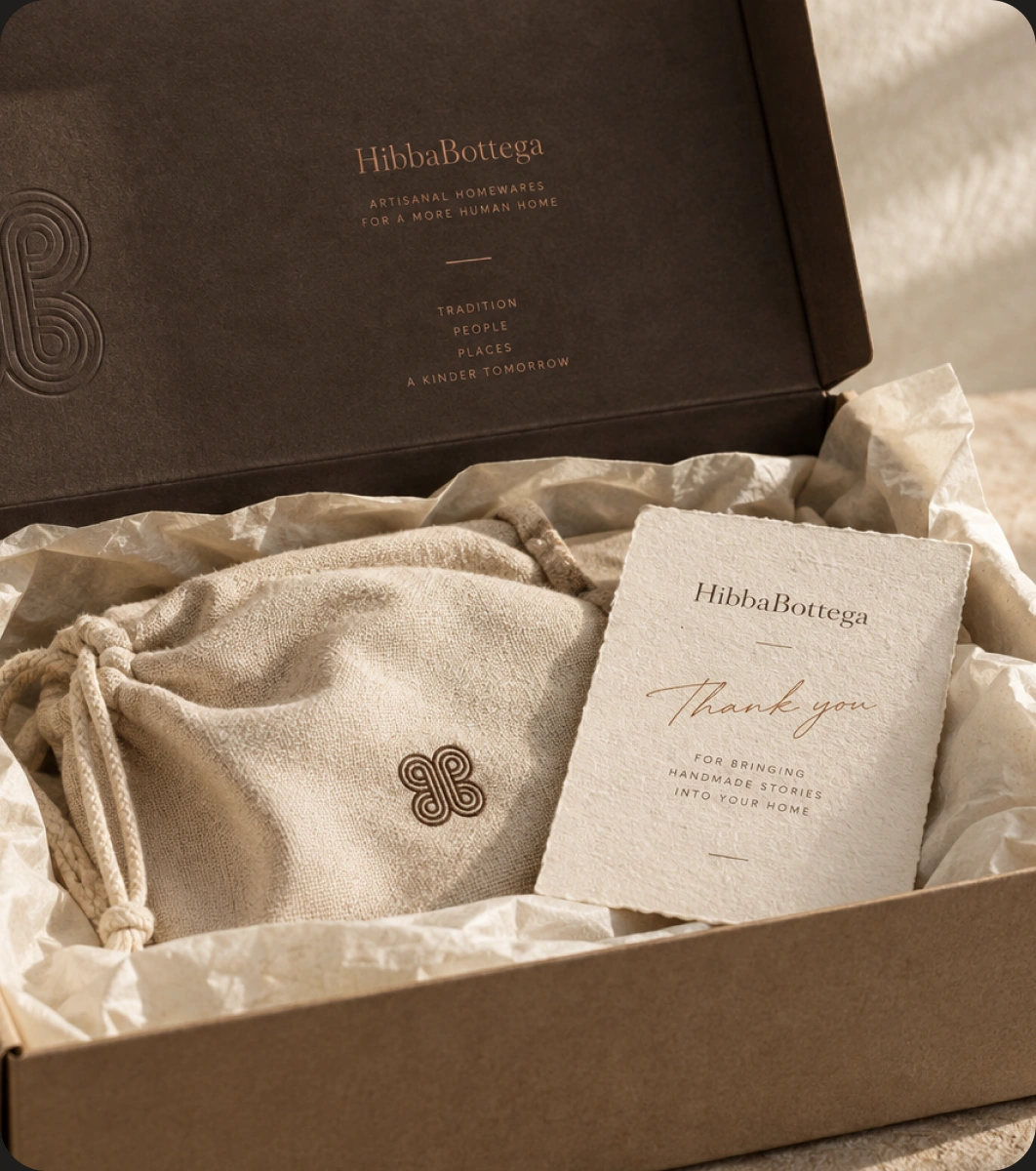
Packagingwith Care
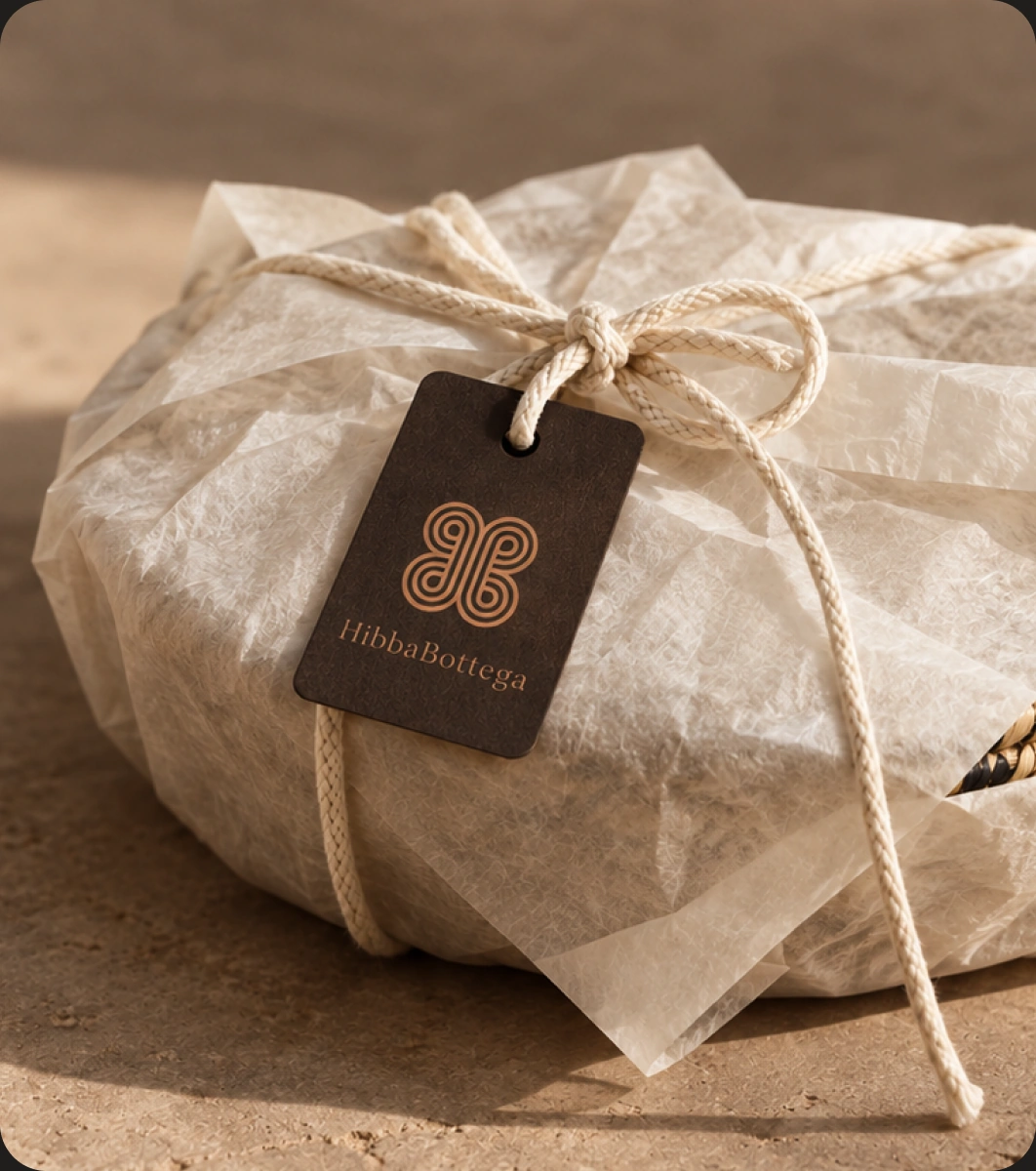
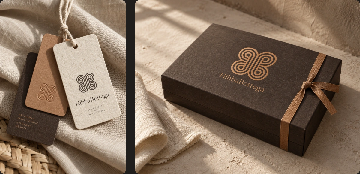
The packaging extends the same sense of restraint and tactility.
Natural papers, subtle branding and simple print details make the experience feel thoughtful without turning it into something overly precious.
Each element was designed to support the product, not compete with it.
One BrandLanguage
Logo, colour, typography, imagery, packaging and digital direction were all developed as parts of the same system.
That consistency helps HibbaBottega feel coherent across different touchpoints while still leaving room for the natural variation that comes with handmade products.
TheResult
The final identity gives HibbaBottega a clearer, more confident expression of what it already stands for: craft, care and intention.
The brand feels contemporary without losing its roots, giving the products and the people behind them a stronger, more recognisable presence.
Craft. Care.Character.
A brand shaped around human craft, thoughtful details and meaningful materials, creating an identity that feels warm, refined and lasting.