Receiptsmade simpleand useful
Keeping receipts and everyday expenses organised in one place.
ExpenseClarity
Receitly started with a familiar problem: receipts are easy to collect and surprisingly hard to keep track of.
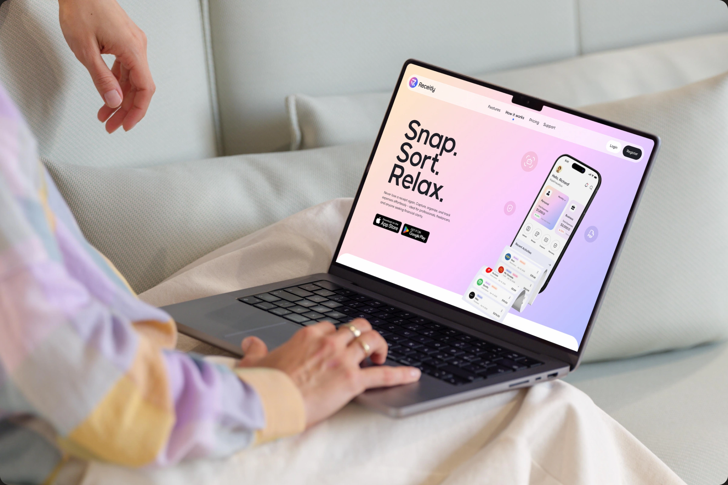
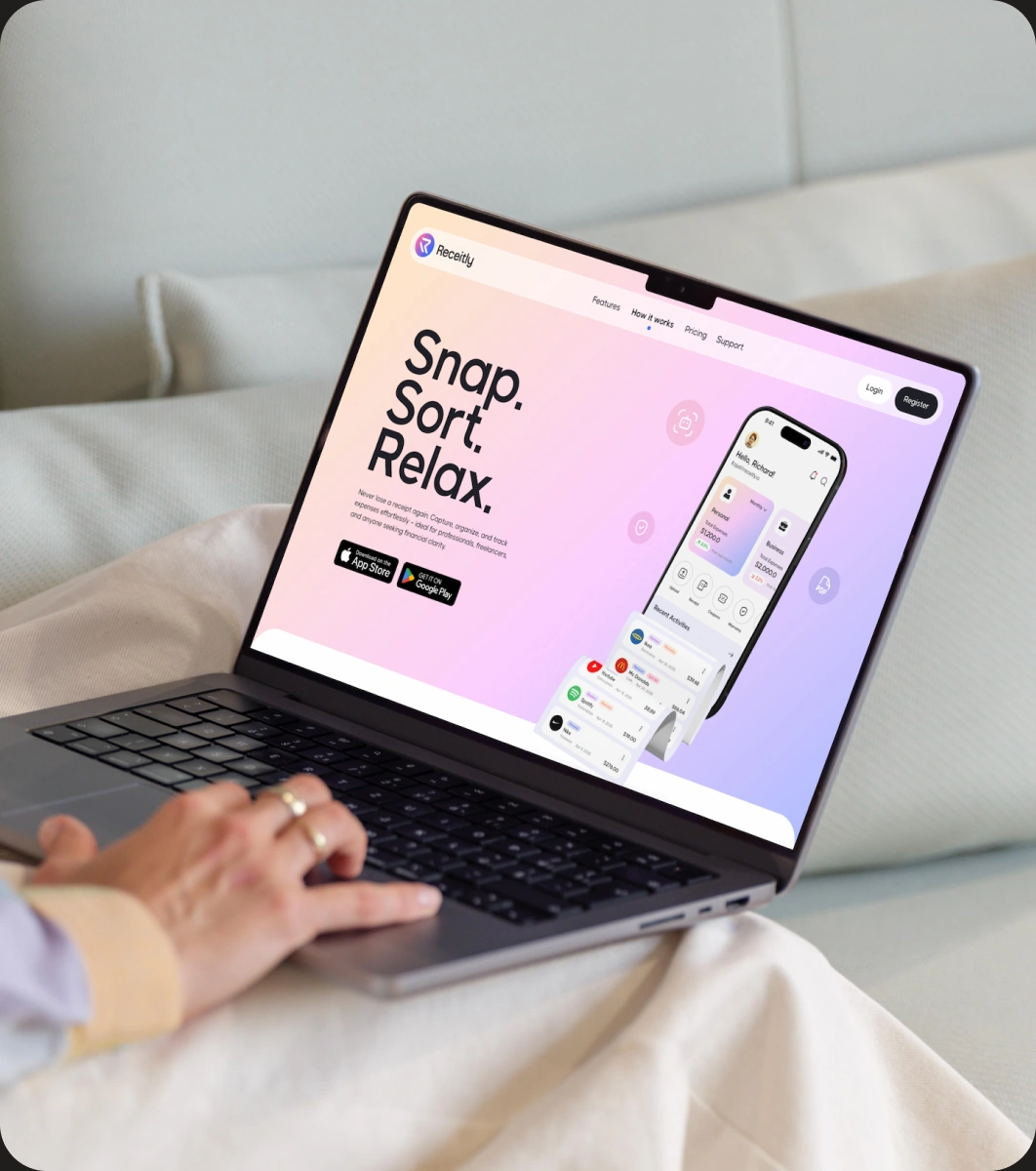
Our work focused on the landing page and app home experience, making the product easier to understand from the first interaction and giving everyday expense management a lighter, more approachable feel.
- Location
- United Kingdom
- Scope
- Product Design
Website Design
Design System - Sector
- Fintech
Expense Management
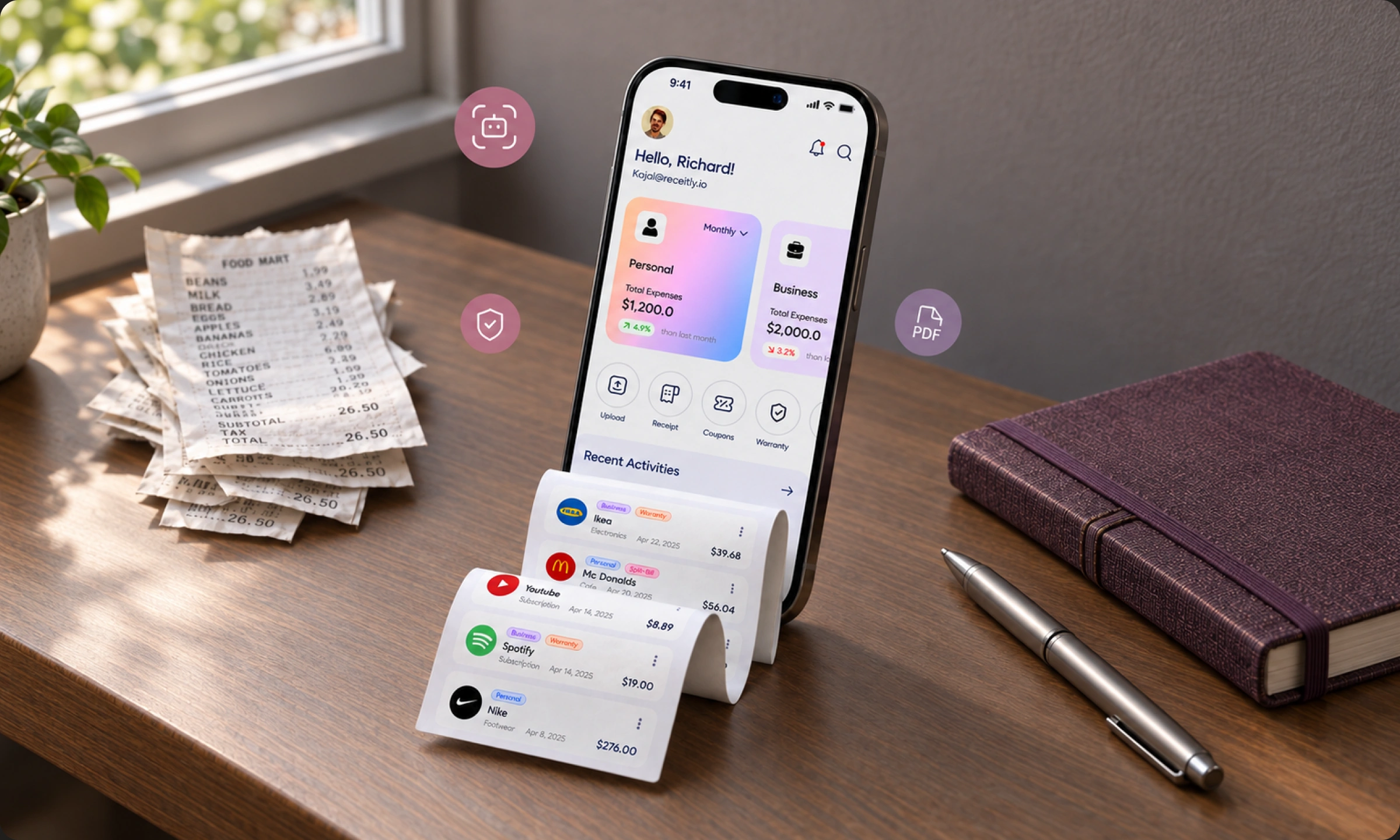
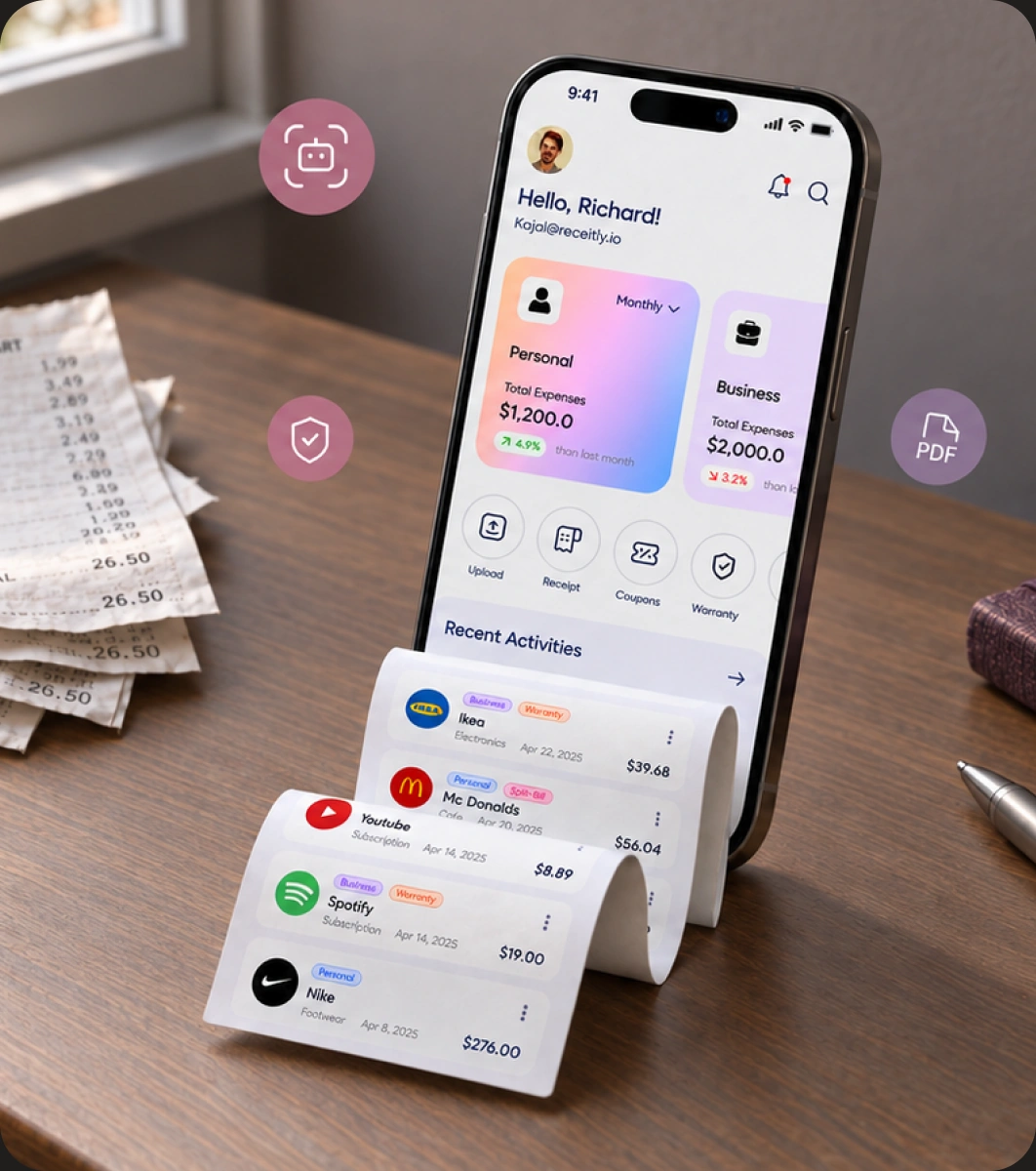
Too MuchAdmin
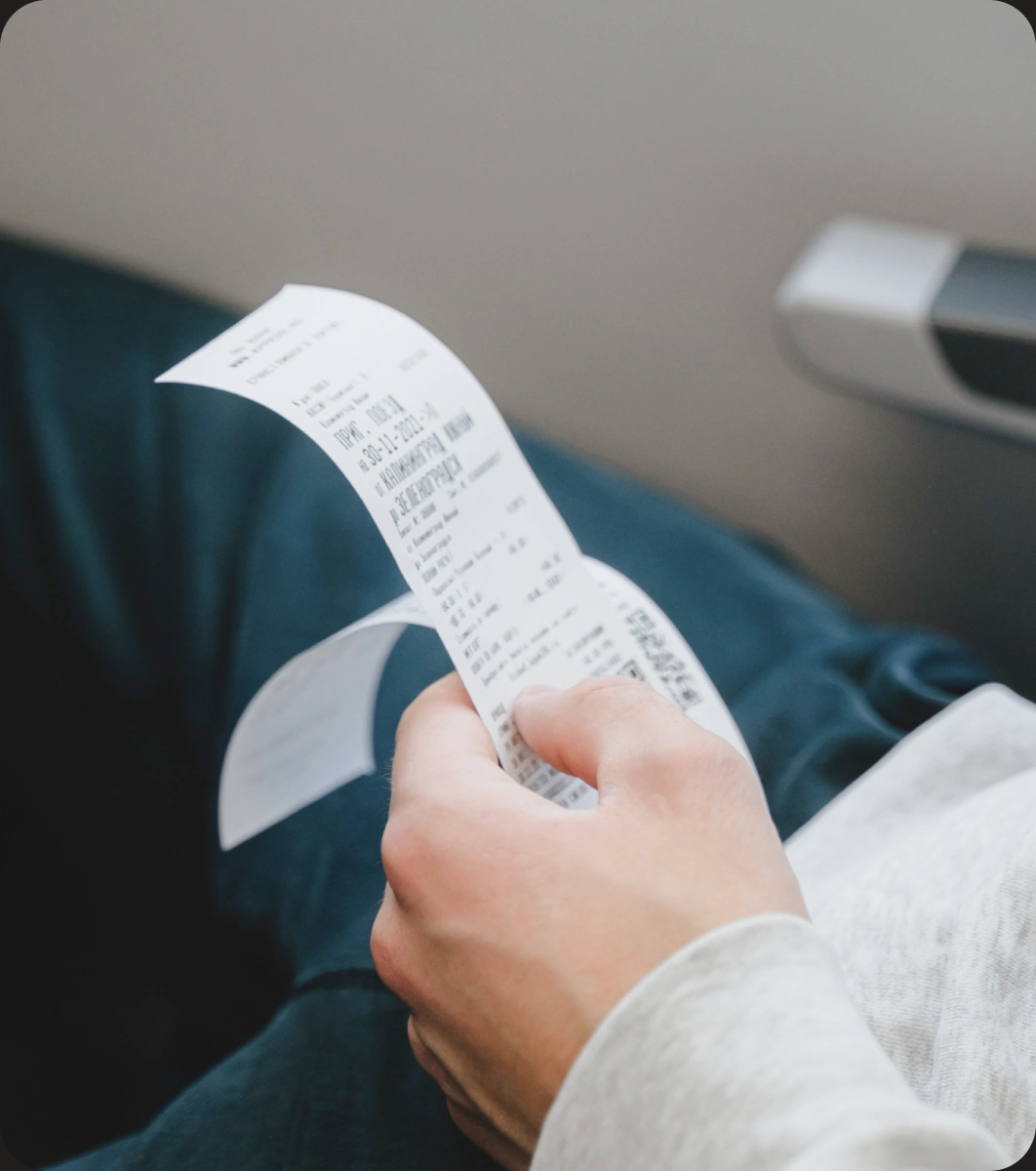
Receipt tools can quickly become another thing to manage.
The challenge was to communicate a broad set of benefits without making the experience feel heavy or technical. We simplified the story around the moments people actually care about: saving a receipt, finding it again and understanding where their money went.

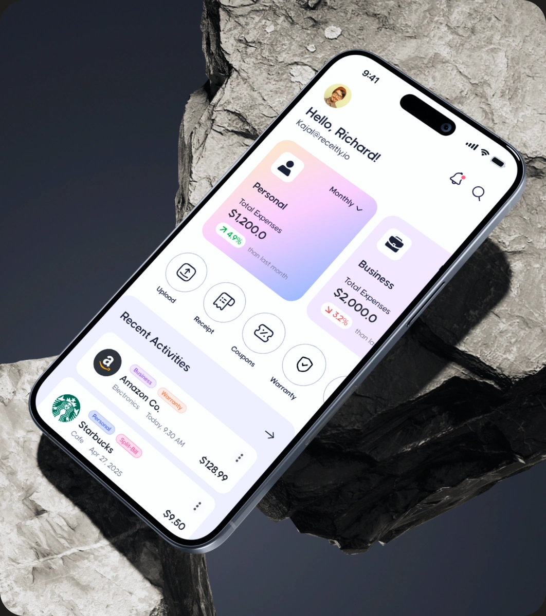
Simpler byDesign
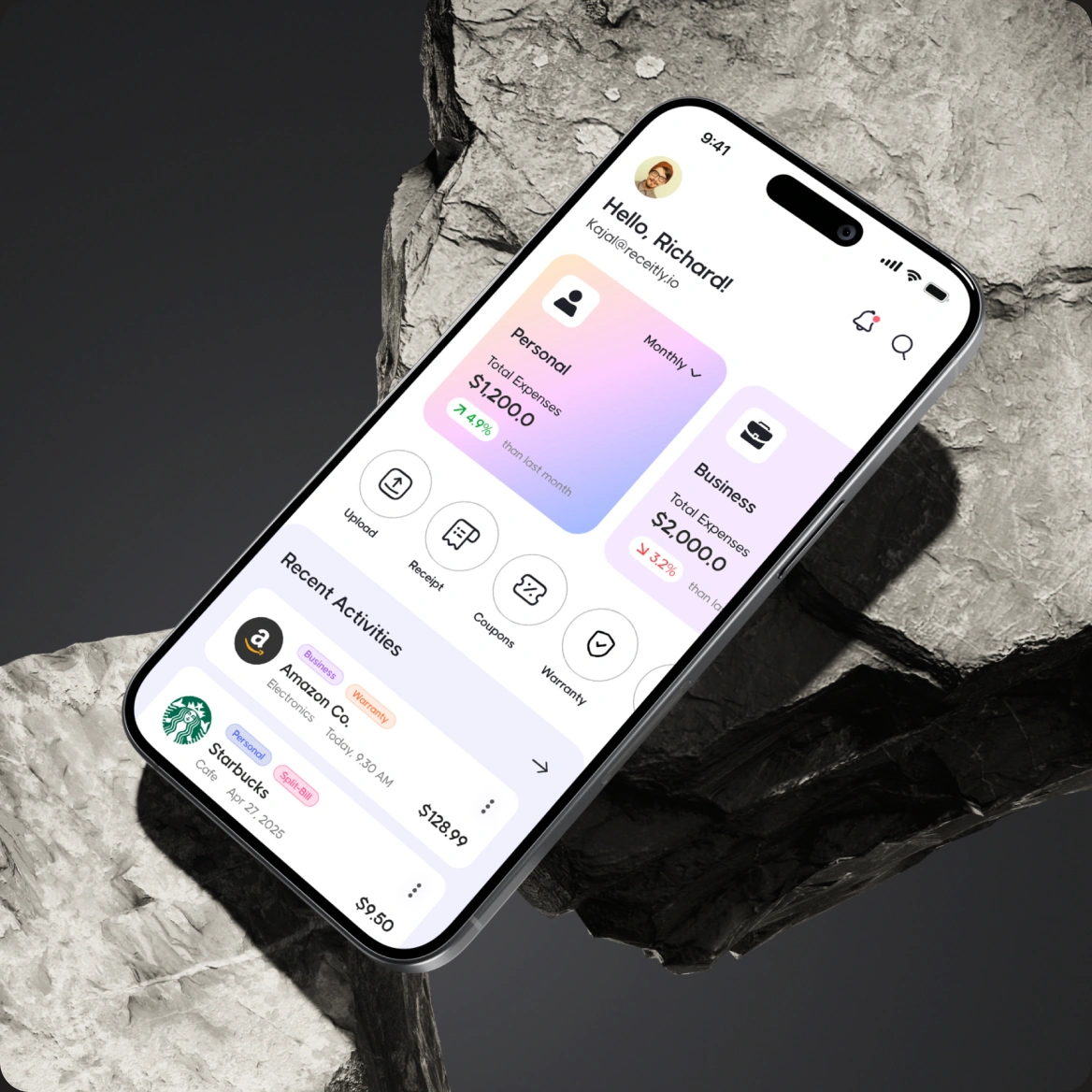
The visual direction moves away from the colder language of traditional finance products.
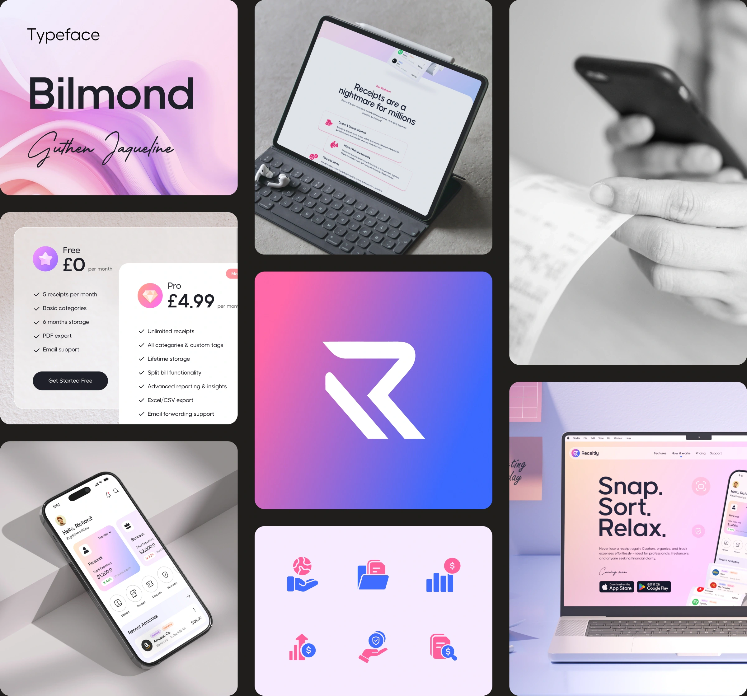
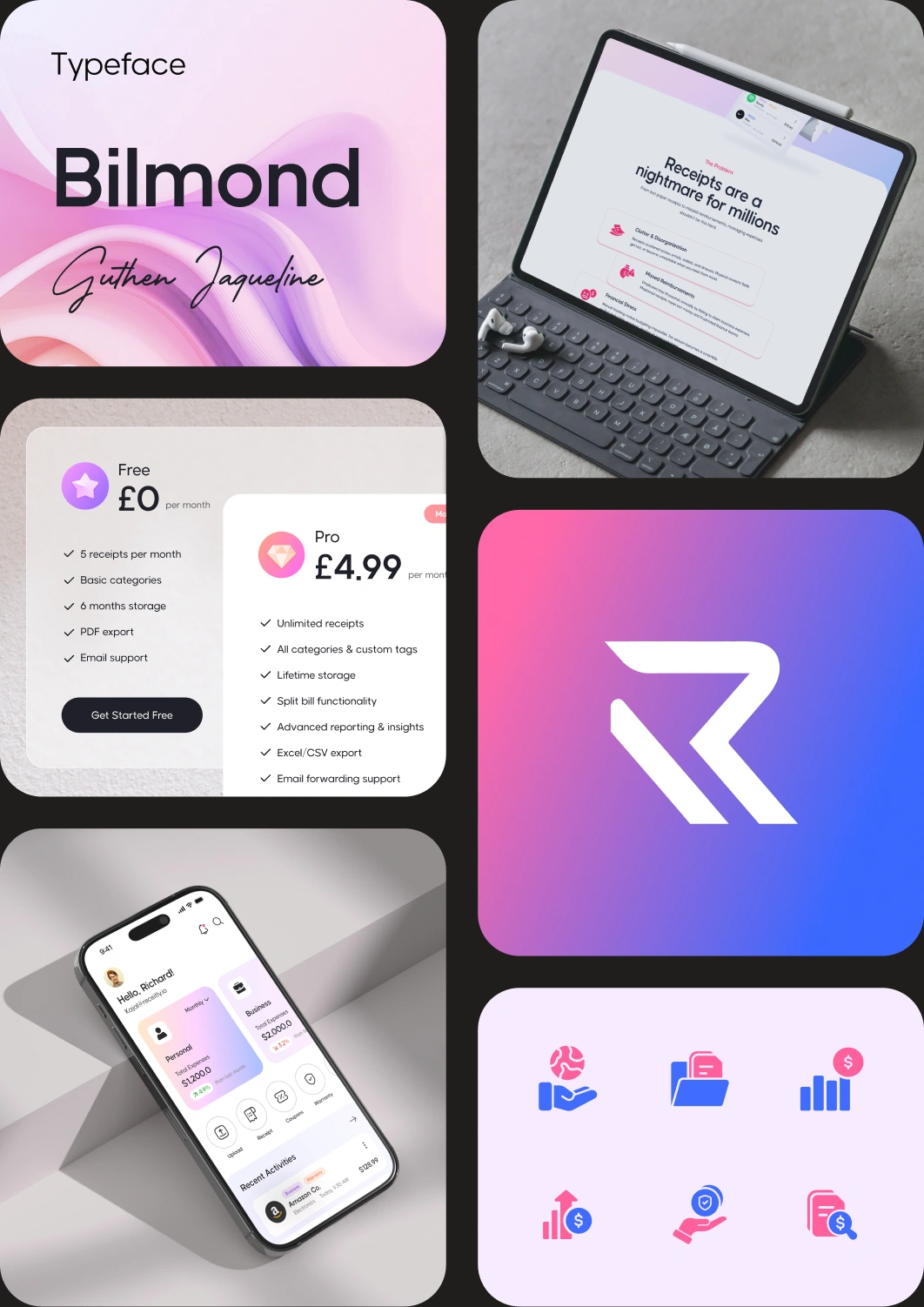
Soft gradients, rounded surfaces and generous spacing give the interface a more personal character, while strong hierarchy keeps important information easy to scan. The aim was to make Receitly feel trustworthy without making everyday expenses feel serious or complicated.
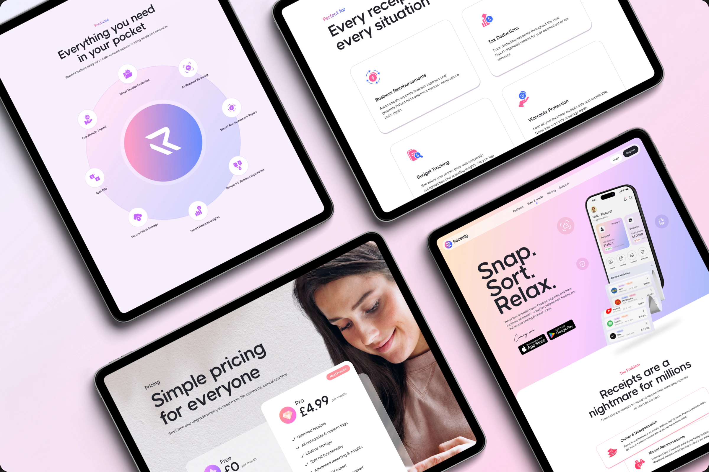
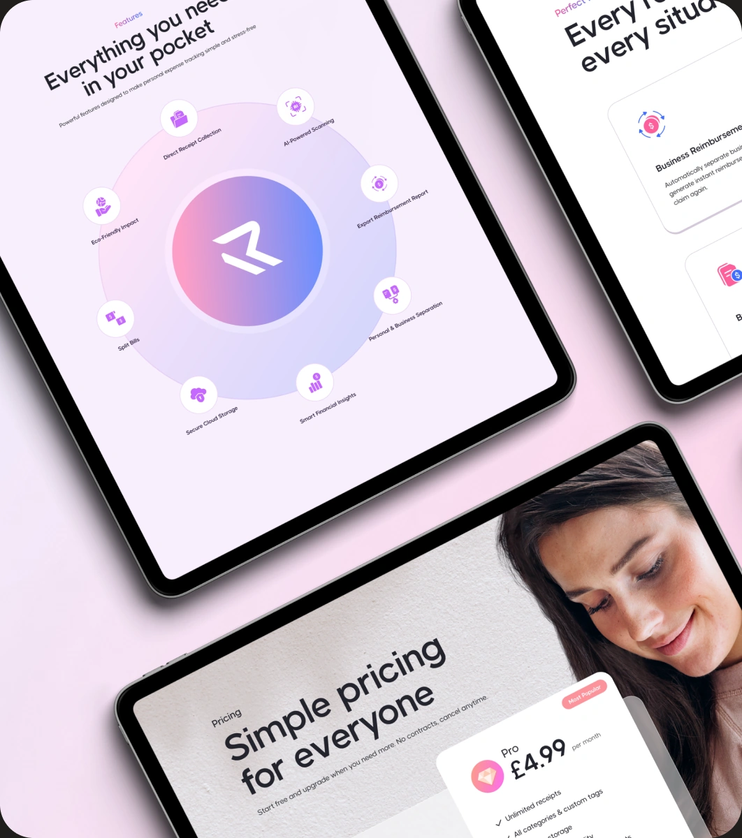
WebsiteStory
The landing page was designed around usefulness rather than a long list of features.
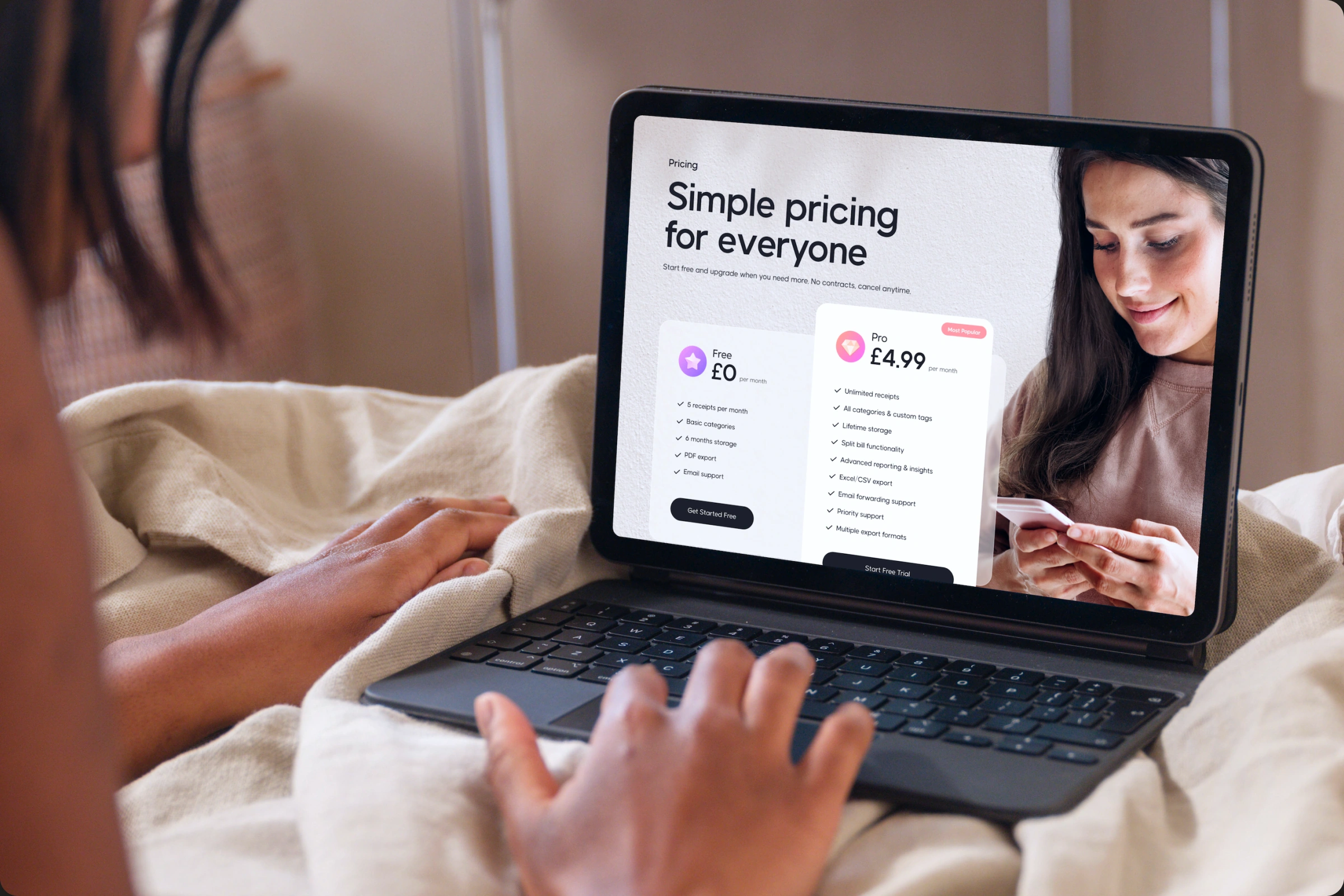
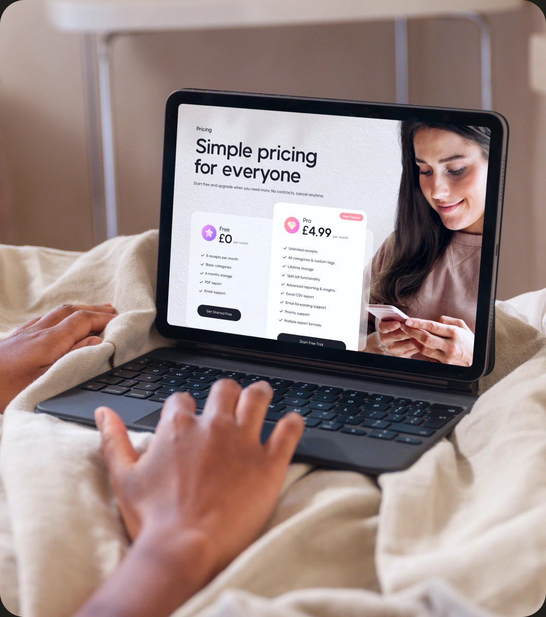
Familiar situations, product screens and simple comparisons help explain what Receitly does and where it fits into everyday life. Each section has one clear job, keeping the story easy to follow as users move through the page.
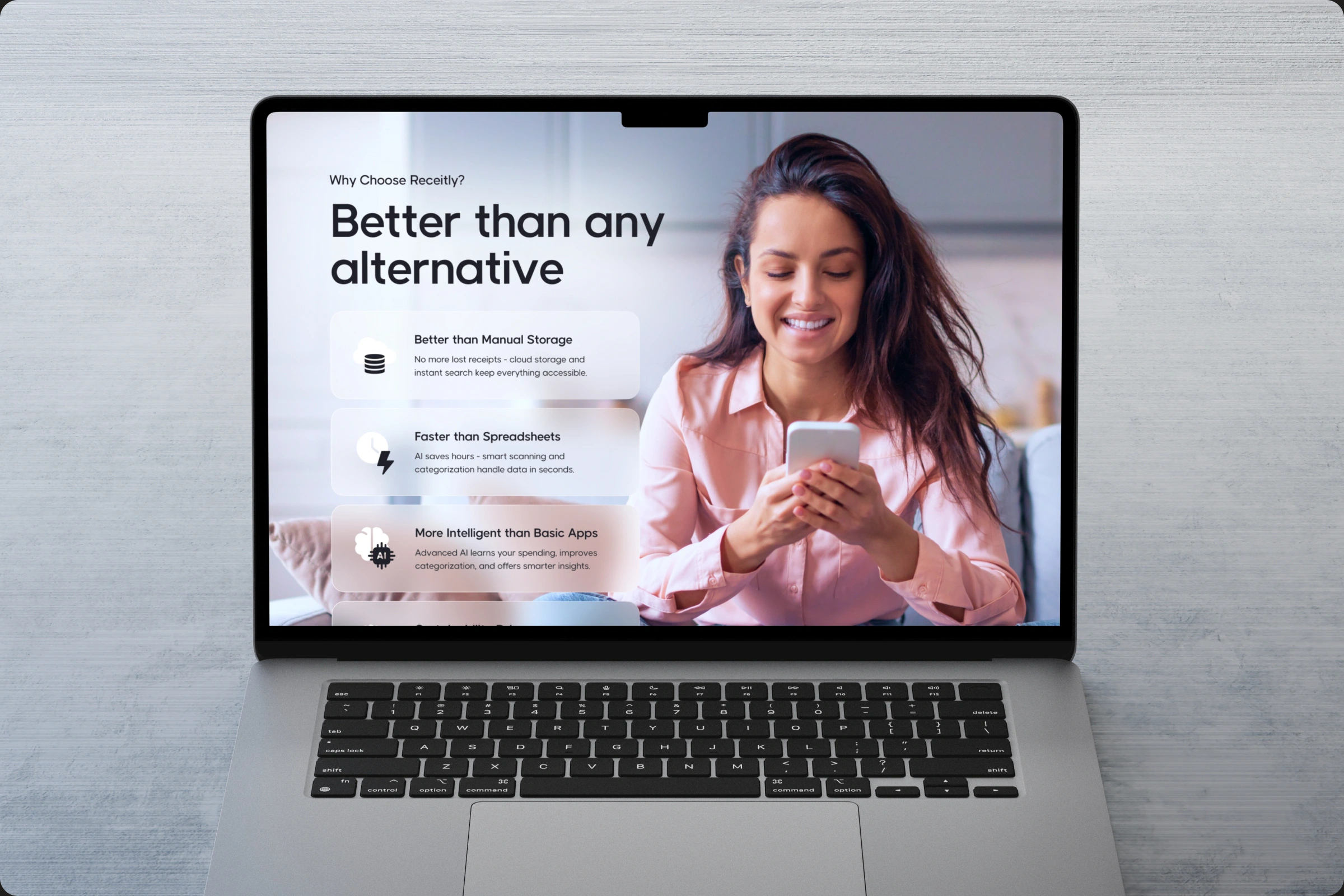

One VisualLanguage
The website and app home were designed to feel naturally connected.
Colour, typography, gradients, cards and spacing follow the same visual logic across both experiences, helping the product feel consistent whether someone is discovering Receitly for the first time or opening the app to check their expenses.
TheResult
The final direction gives Receitly a warmer and more focused digital presence.
The product feels less like expense software and more like an everyday tool: simple to understand, easy to come back to and clear about the value it brings.
Less to sort.Easier to find.
A simpler place for the receipts and expenses that usually end up everywhere.